➡️ Project Description
Design a dashboard UI for a telecom operator for numbers allocation, order information, and cost visualization. The dashboard screen should visualize:
⚪ How many numbers are allocated?
⚪ Is there a need to order numbers soon?
⚪ Provide an action to order more numbers
⚪ An overlook of the clients, growth, and expense over a period
➡️ Purpose of Dashboard Screen
The purpose of the screen is that the telecom operator would be able to understand what is the situation with numbers allocation, clients distribution, and expenses to estimate the next order.
➡️ My Process
➡️ Gathering user requirements
I started the design process by gathering the user requirements by conducting several interviews with the stakeholders including the product owners and end-users of the product.
➡️ User Persona
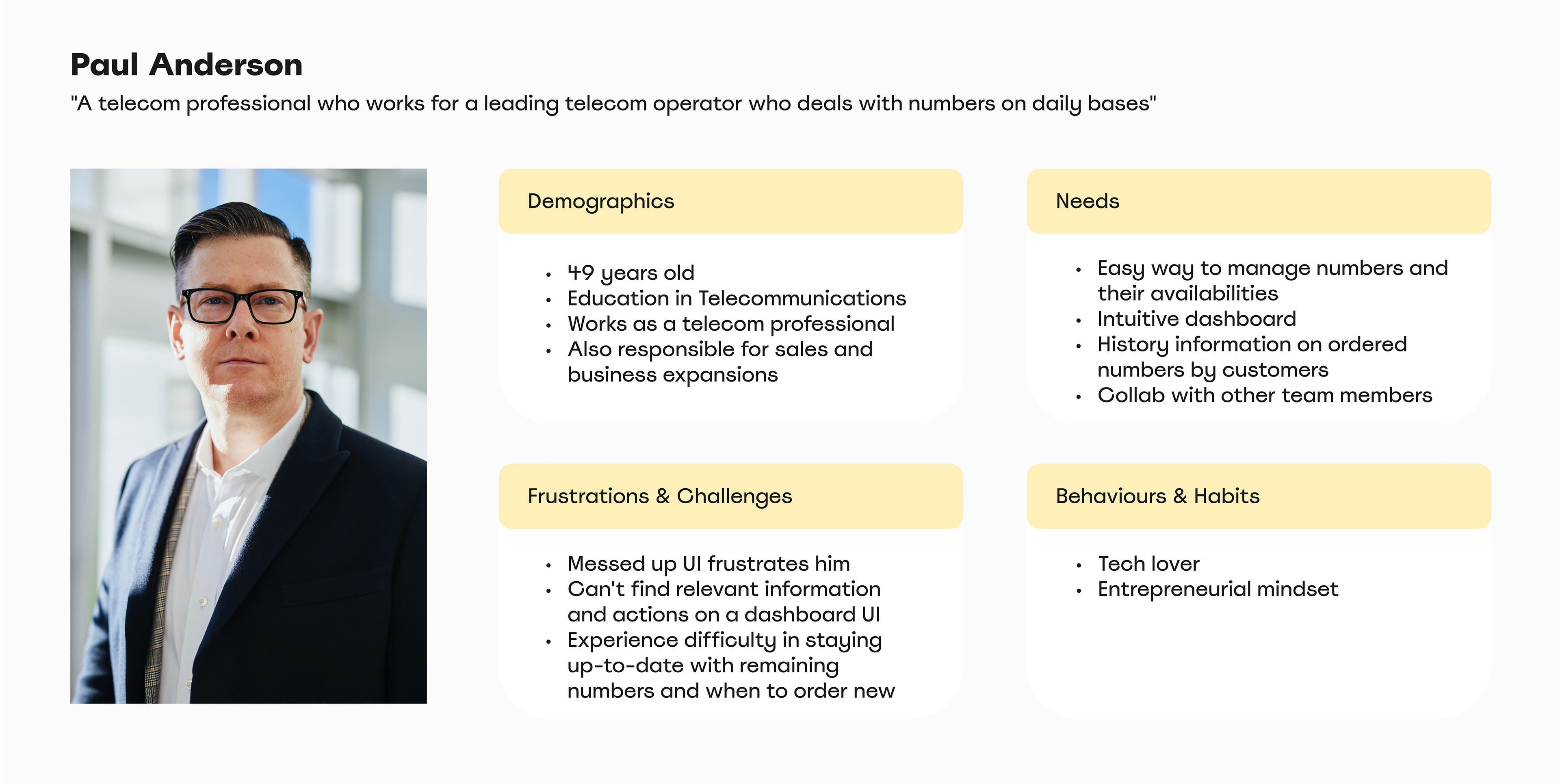
➡️ Problem Statement
Our telecom operator needs to know the numbers capacity, and how their budget expense has been happening so that they can order more if needed. At the same time, they would like to see their client's information and be able to communicate with them.
➡️ Goal Statement
Our solution will let the telecom operator easily and efficiently manage their numbers space and order more. This platform will also provide them with detailed expenses and growth over a period of time making it easier for them to understand budget-related aspects.
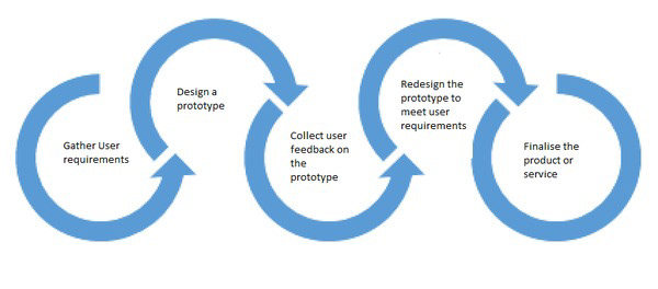
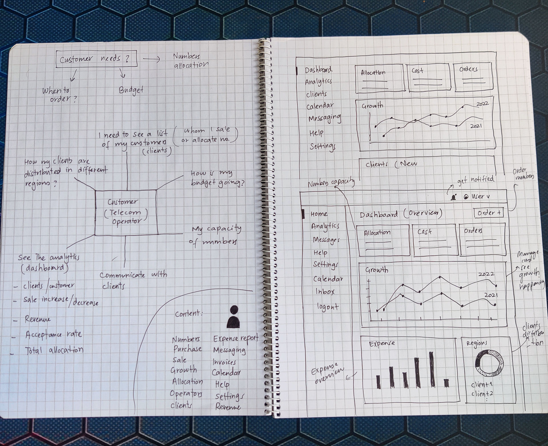
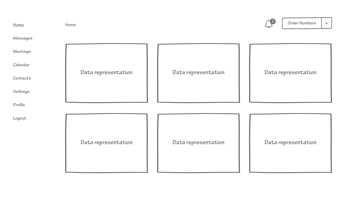
➡️ Ideation and Sketches
After defining the exact problem statement and goal statement, I started to visualize and brainstorm different ideas that could be the possible solution. I focused on HMW (Home might we) technique to come up with several ideas.
"How might we make it easier for the telecom operators to order numbers?"
"How might we provide the user with their expense information over a period?"
"How might we solve the operator's problem of not knowing the allocated numbers?"


➡️ Feedback Collection
Getting feedback from the users and other stakeholders in a user-centered design process is a vital step. I gathered feedback on these initial designs in order to show the rough idea and concept of the possible solution. After getting feedback, I moved towards a high-fidelity design of a dashboard in Adobe XD.
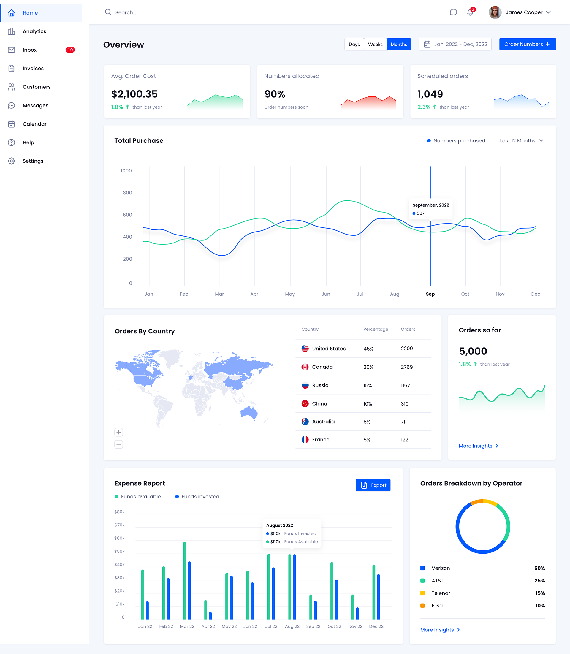
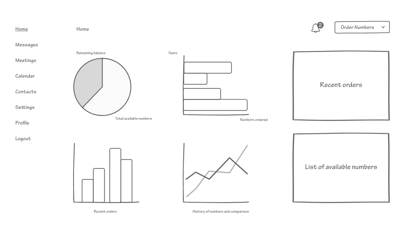
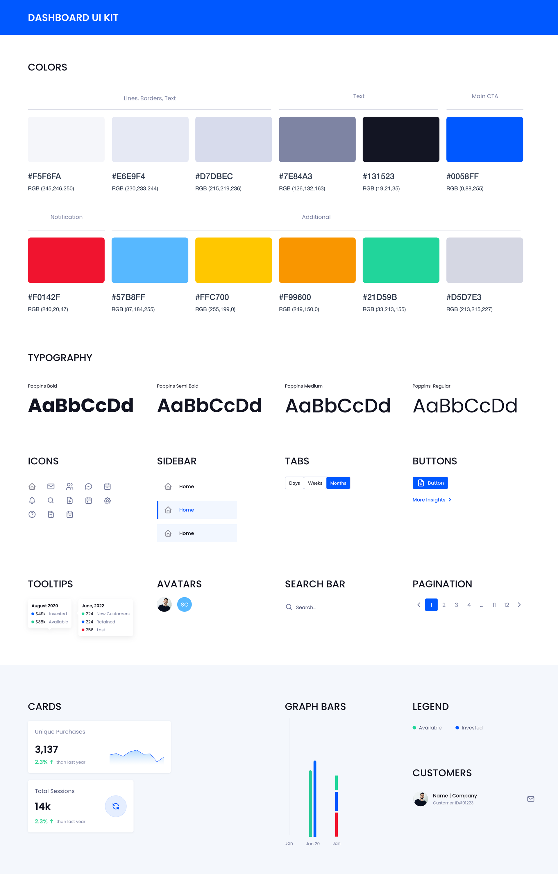
➡️ High-Fidelity UI Design
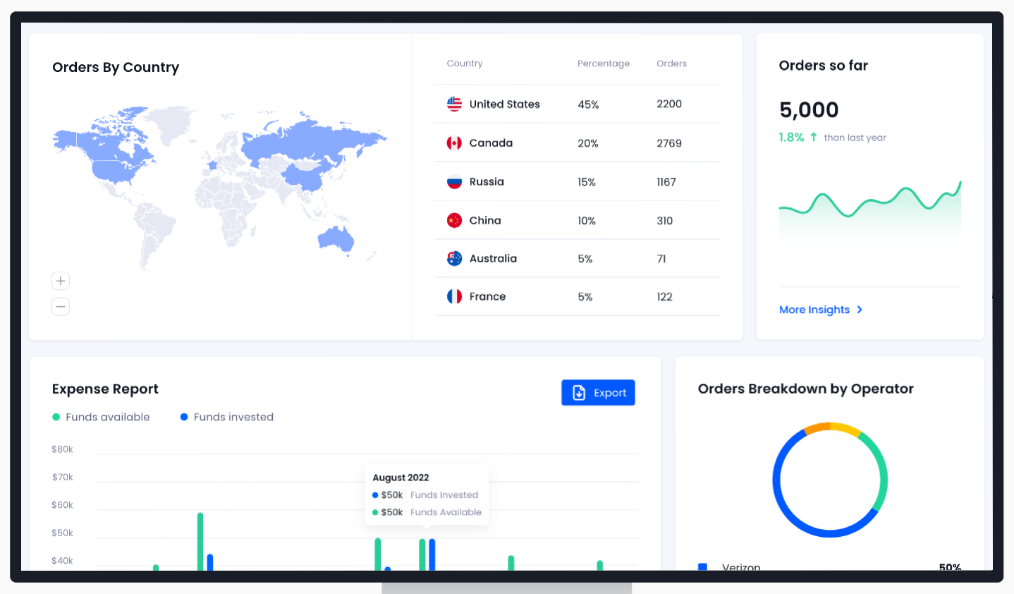
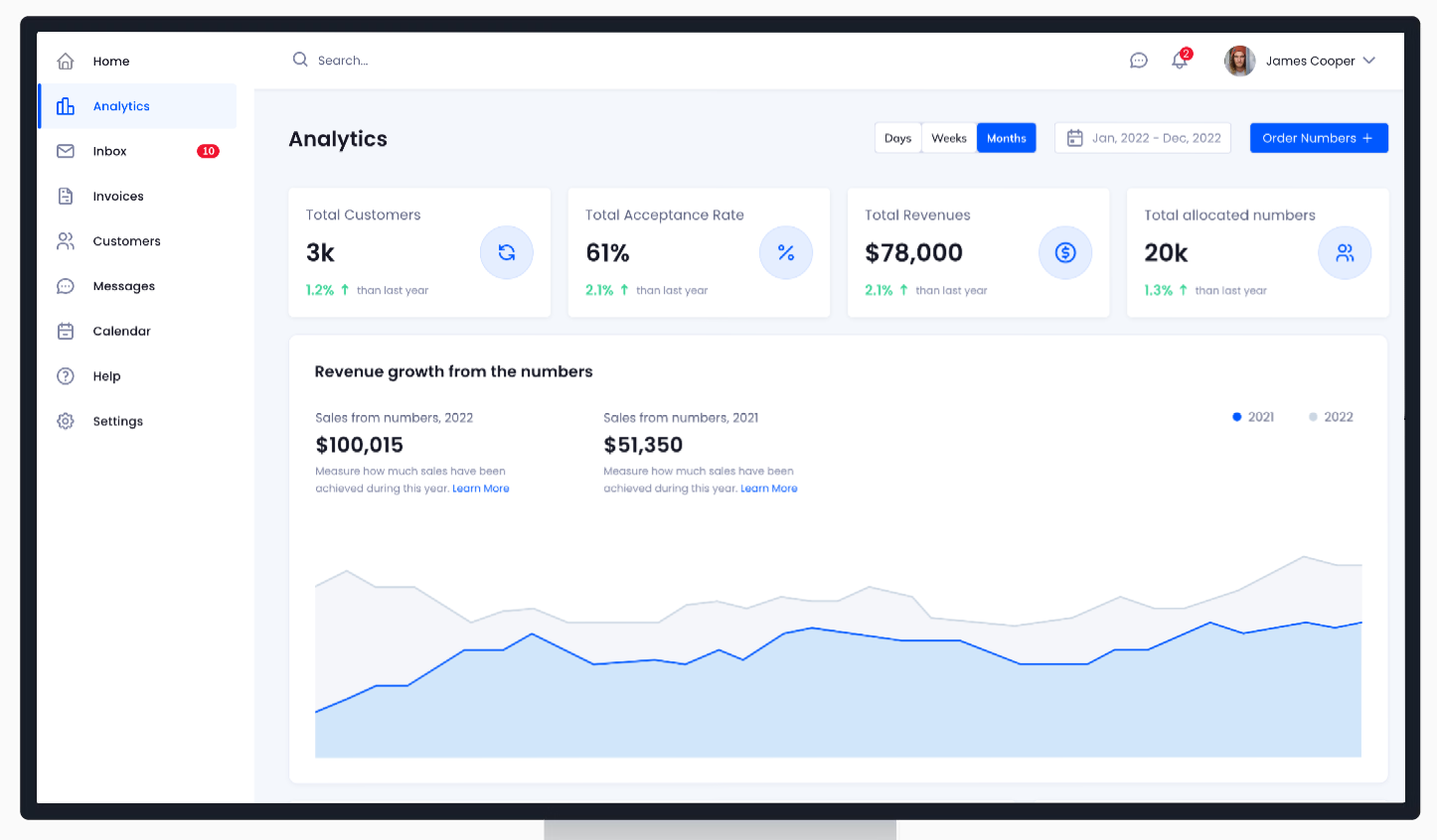
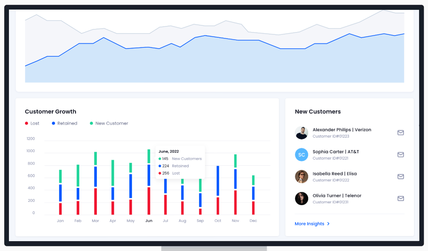
High-fidelity designs are closer to the actual look and feel of the product. Below you can see the homepage which is the dashboard (Overview) for the telecom operator to look into the data visualization, numbers space, client information, and budget overview. The operators are able to order numbers right away or they can also schedule the order making it an automated process for them.
➡️ Next Steps
⚪ As an iterative process, user testing was conducted again
⚪ Design spec and prototype delivery to the development team
⚪ Collaboration with the development team for successful and efficient product implementation
➡️ Users Feedback
⚪ Simple and minimalist UI
⚪ Easy solution to our problem
⚪ Hopeful that their level of frustration will be decreased and the automation of the process of ordering numbers is a great feature
⚪ Visually, the design looks nice
⚪ We would like to see how the rest of the screens look like and what type of content will be displayed on them