➡️ Wicked Problem
The key challenge is engaging students to report their sustainable actions, as they currently lack motivation. Stakeholders prefer a complete, low-maintenance design, with optional guides or gamified elements for users unfamiliar with sustainability. However, they provided limited requirements and no prior designs, allowing us creative freedom in the approach. This requires a user-centered solution that balances engagement with minimal upkeep.
➡️ Project & Personal Goal
Our team’s goal was to design a meaningful, impactful form for sustainable communication, incorporating gamified rewards to encourage users to report their actions. A key focus was applying study analysis methods from our coursework in a real project. Additionally, we aim to strengthen collaboration with stakeholders—including customers, target users, and team members—to create an effective, user-centered solution.
➡️ Business Logic
The primary goal of this product is to enhance the welfare of Tampere University students, rather than generating market profit. While no direct competitors exist, effective promotion is essential to encourage student participation and collect valuable data. Key promotional channels will include the TUNI intranet and email system, emphasizing that student engagement can positively impact their overall university experience.
➡️ UX Goals
Our usability goals focus on making the form easy to use, easy to learn, accessible, and effective:
Easy to Use:
The form is designed with a minimalist layout, reducing fields to essential ones, allowing users to easily report sustainable actions or learn about sustainable development goals.
Easy to Learn:
The platform is intuitive for both novice and experienced users.
Accessible for All:
Inclusivity is prioritized, ensuring the form is accessible to all users.
Effective:
The platform is built to support users in achieving their reporting goals efficiently.
Additional UX goals include creating an enjoyable, rewarding, and informative experience that promotes social awareness and motivates sustainable contributions. Early prototypes have implemented these core usability goals, with usability testing planned for further refinement.
➡️ Methodology & Design Process
The project methodologies included semi-structured interviews for user research and affinity mapping for analysis. From the research insights, we developed two personas. Additionally, expert evaluation was conducted to refine the design further.
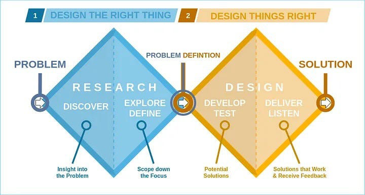
Fig. Design Process
Since our target user of the design is TUNI students, we invited 4 TUNI students age range from 26-35 to conducted 4 one on one online user interviews. Each interview lasts for about 30-60 minutes. The research focused on 2 main themes, one is sustainability actions and knowledge for it, the other is about filling online form and reporting actions. All the interviews have been recorded for further analysis. All the participants have asked to fill in their consent for recording the interview.
Our design follows the Double diamond process design model. The main processes are discover, define, develop, and deliver. Based on that, we walked through the research findings first, summarized the user context and user need, followed the personas as references, kept thinking of our customer needs, then formed the design goals and early vision for the design; then wireframe and test the design with some expert evaluation principles. For each phase, we tried to keep the user involved. We value the needs of our customers and users, and always keep the core problem in our mind. We conducted kickoff meetings to find out the needs of customers and interviewed the target user target group trying to understand and empathize with them. Besides, we follow the iteration principle and made improvements based on our expert evaluation after the prototype has been done.
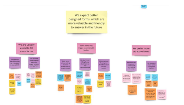
Fig. User interview analysis
➡️ User Personas
Based on the findings, we created the following two personas to support our following design work.
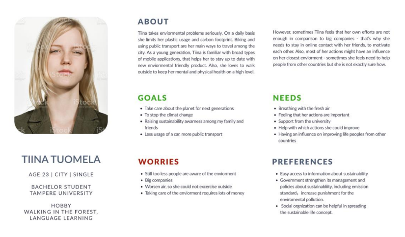
Fig. Persona 1
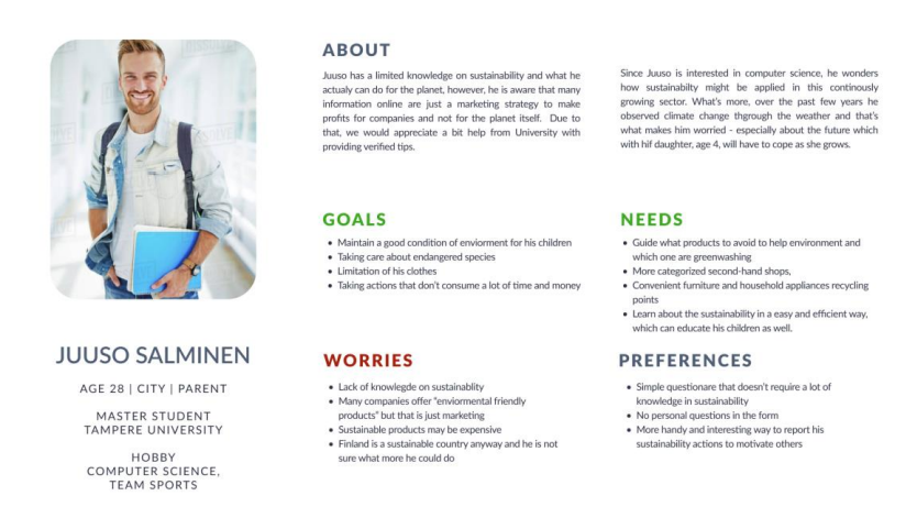
Fig. Persona 2
➡️ Users and Context of Use
Understanding the context of use is crucial for a successful design project since the way users interact with the system depends on their characteristics.
Before using the solution: The form we are designing is going to be included within the TUNI system and can be used by TUNI students. Usage of the solution is voluntary, so users that open the form are already interested in filling this one or at least curious about its questions or general interface. With that being said, the main motivation for users is a willingness to help, satisfaction caused by inputting answers or feeling of a mission while sharing their own actions with a positive effect on the environment. A user is obliged to give a consent to analyze and process their answers, otherwise the action must not be continued.
During usage of the form: In general, the form must provide positive emotions in users also by not putting pressure on them or feeling guilt. What is more, the form must allow users to correct their answers, go back to previous questions, or abort filling the form at any moment. In order to ensure a sense of freedom in expressing one’s thoughts, the form aims to open questions that are not suggestive.
After completing the form: In order to provide a good user experience and lack confusion, the end of the process must be clearly shown to the user. Also, inputting one’s answer is not paid, so the system should at least thanks user for their time. For transparency, users should be able to sign for a newsletter that is sending them a general rapport summarizing TUNI students’ actions regularly. Such a newsletter might also remind users to use the system once again.
Stakeholders: The number of stakeholder of this project is relatively small. Employers at the Tampere University related to sciences on sustainability accounts for the most crucial group, because they will analyze answers from students as well as create reports summarizing results. Another group of stakeholders is students from this field of study, who were also clients and contact people in this project.
➡️ Prototyping & Evaluation
We have created a hi-fi interactive prototype which will be integrated on TUNI intranet for the design by Figma. Due to the information insufficiency, the current solution might not be perfect. According to our customer, the form needs to be designed in a straightforward way, however, with a clear understanding of what steps users must take next. So, we just keep the right column as a filling area while the left column as acknowledging area.
The evaluation methods we used is a quick expert evaluation. By the guidance of principles like Nielsen 10 usability heuristics, Shneiderman’s Eight Golden Rules and accessibility principles, we worked out findings, we improved our prototype in many ways. The reason is straightforward. Firstly, these principles are efficiency and effective. Secondly, our design is relatively simple, every interaction is conducted in one web page, it is intuitive to evaluate with the heuristic principles. Thirdly, it does not require much time for the evaluation and iteration. However, the limitations are still obvious, for example, basis is always there, and not all the issues could be covered. Example 1. For the aspect of consistency, we took an example from TUNI intranet. Then updated the heading section based on the style of intranet. In addition, the previous introduction of heading section was a too long row to read. This change also solved this problem of accessibility.
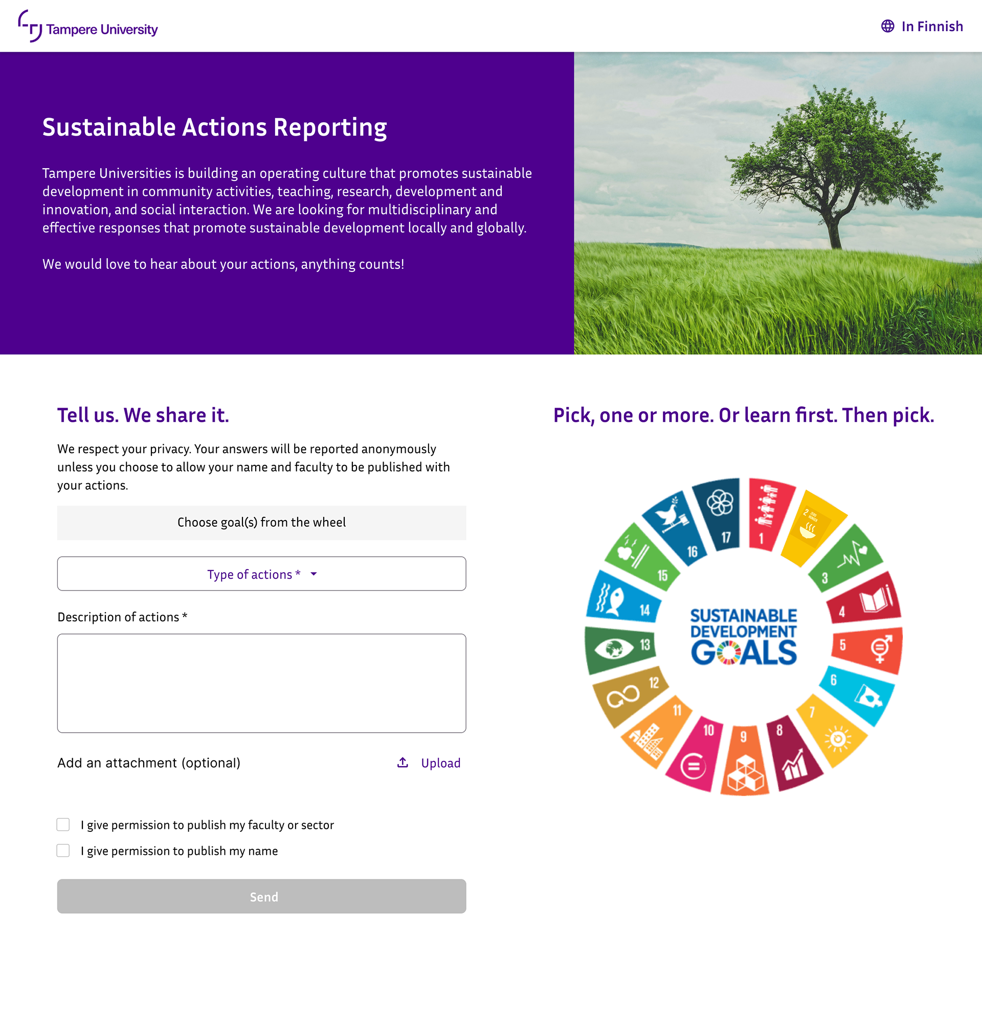
Fig. Main starting page of the form
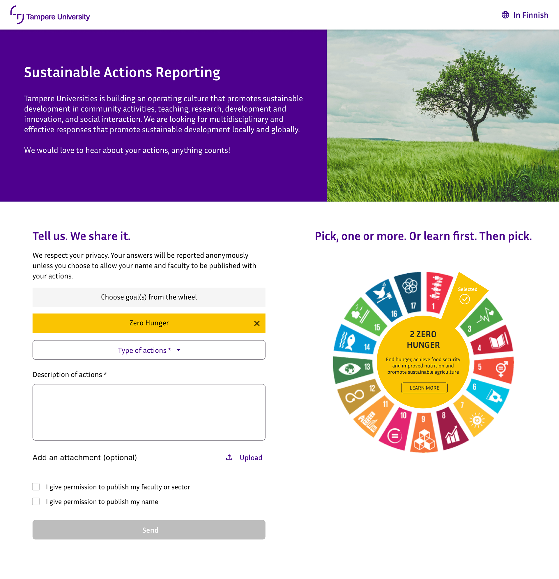
Fig. When the user has selected a sustainable goal
➡️ Ideas for Future Development
The link leading from the goal descriptions to the UN’s SDG page of the specific goal is just a suggestion. Maybe, in the future, this link would lead to some kind of gamified way of learning about the goal?
About the form itself, we are not quite sure if it has all the input fields that are needed. Those can of course be added, if necessary, but we would suggest keeping the form as simple as possible and remembering proper grouping and flow of the form.
“Type of actions” can be replaced with radio buttons, if there are only few options. We, however, believe that there is more.
“Daily life actions, research, dissertation, other”, there is already four. This is why we assumed that dropdown would be proper solution for this choice.
Text field for “description of actions” could maybe be larger, but at least it should be scrollable. It could also be manually expandable. While we have noticed accessibility aspects in our design, there are still some open questions regarding the wheel feature. At least the wheel feature could be quite hard to operate for example for screen readers. Perhaps, there could be completely another, accessible version of the page to choose that would replace the wheel as a way of choosing goals.
"Progress bar" indicating the progress of filling the form came up in the suggestions in our research interviews. We were thinking about including it for a while, but ended up discarding the idea, because we think that the form should fit to such small space (one page), that there is no need for progress bar. It would be different case, if the form would consist of several views/pages.