➡️ Project Overview
The targeted application was the online booking service of 'Aava Medical Center' for improved usability. The mobile version of the website was analyzed and the prototype was evaluated and developed in two iterations. The first iteration was 'Heuristic Evaluation' and then the second phase was user testing.
➡️ My Contributions
The project required each individual in the team to be a 'Project Manager' for a specific duration of time. So, I worked as a ‘Project Manager’ in the user testing phase. I was responsible for arranging and conducting meetings, prepare a future plan, and submitting the updated results. Furthermore, I took part in user research, heuristic evaluation, and developing the final prototype. I also worked as a 'Facilitator' in the user testing process. I made the video of the initial and final prototype which is added in the last section.
➡️ Motivation
There were different platforms we looked for and ended up with Aava. The main reason was that we wanted to research and improve an already well-developed service to learn more. We knew that once we start working and analyzing it, we will definitely get things to make better, which eventually happened.
➡️ Tools
Balsamiq Wireframes, Illustrator, DaVinci Resolve
The Process
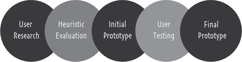
1.
User Research
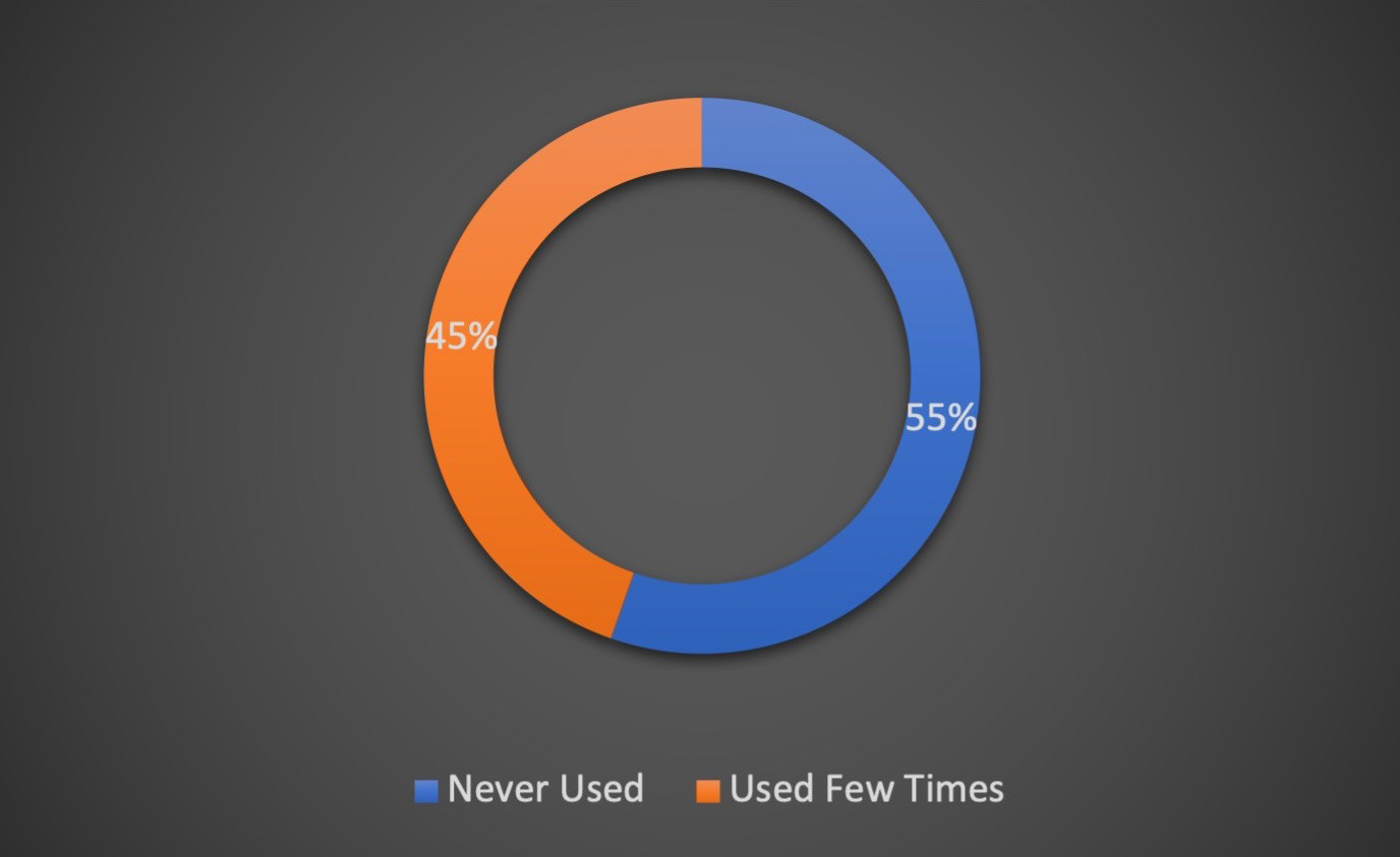
Due to Covid-19, we were not able to meet people in person. So, we interviewed people within our families and friends as everyone around us uses medical services. There were some users who were not even familiar with the 'English' version of the website
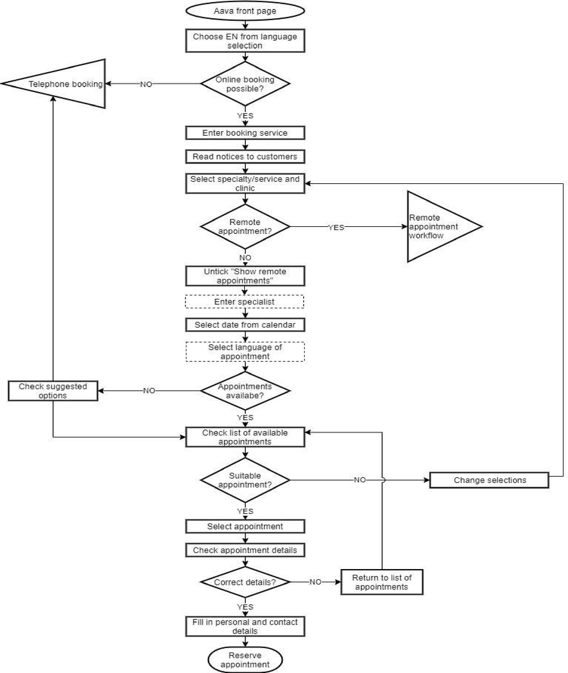
➡️ User Flow Chart
Here is the user flow diagram which was developed to better visualize the navigation within the website.
➡️ Personas
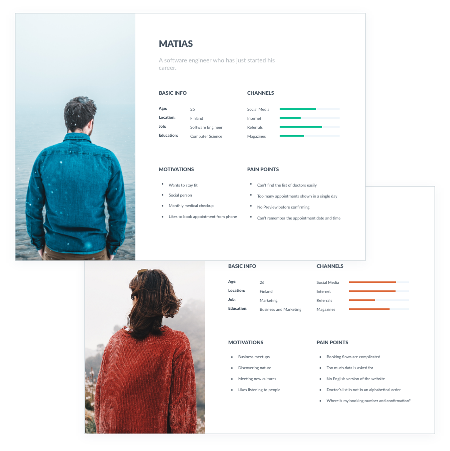
Based on the interviews/workshop, we set up these two personas. We referred to them throughout the entire product development process.
1. During the user research phase when we were listening to user stories and pain points, we decided to develop user personas
2. The 'User Research' method was used to develop these personas
3. We have provided basic background information, their pain points, motivations, and their activities on different channels
4. These personas helped us in improving the prototype as we had their pain points in front of us throughout the process
5. While developing the prototype, we had put these in front to see if there is anything we have missed or not
2.
Heuristic Evaluation
The Nielsen Norman heuristic evaluation was performed to gain an understanding of the usability issues found in the Aava booking system.
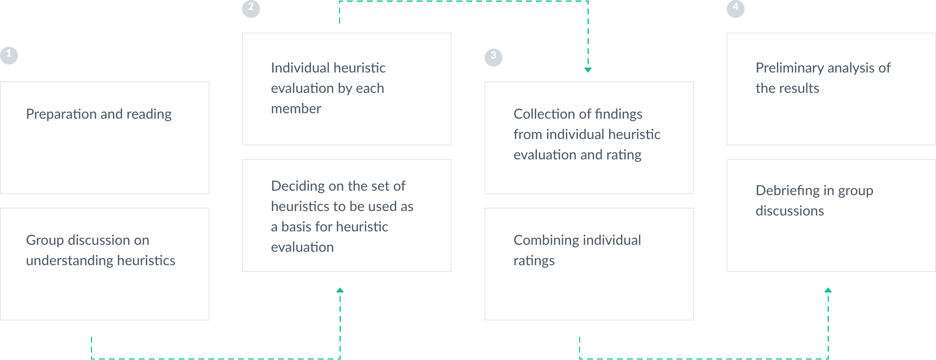
"Process of conducting heuristic evaluation"
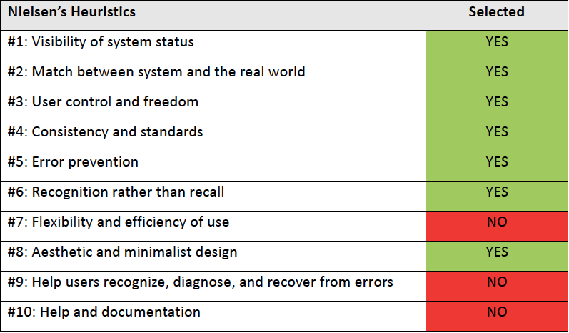
➡️ Selection of Heuristic Evaluation in our case
We decided to concentrate on seven heuristics instead of all the ten to permit deeper analysis. These were used as a basis for the heuristic evaluation of the Aava booking service.
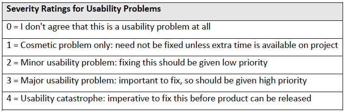
"Priority Rating System for Heuristic Evaluation"
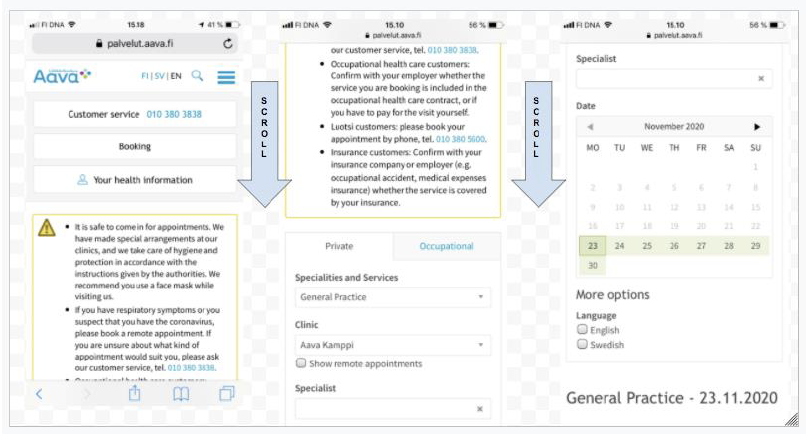
➡️ Collections from Heuristic Evaluation
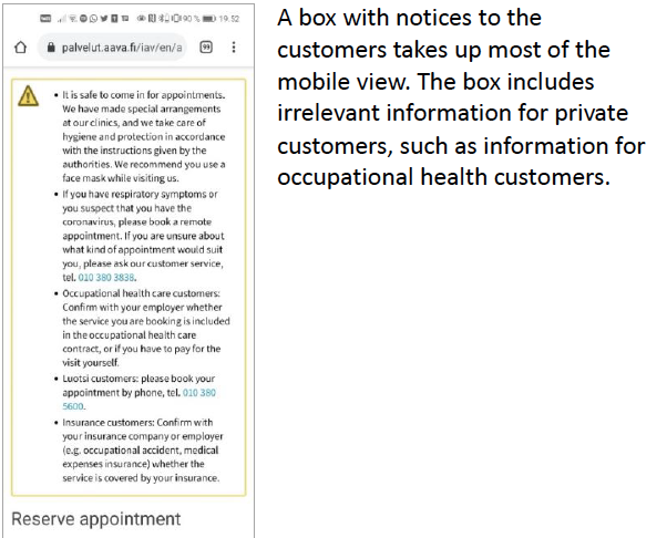
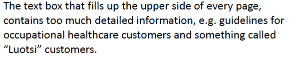
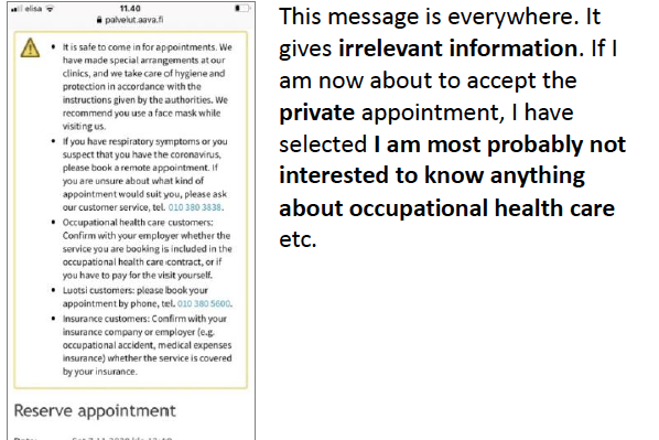
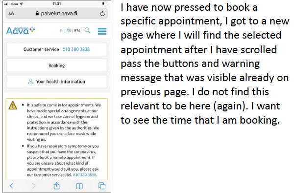
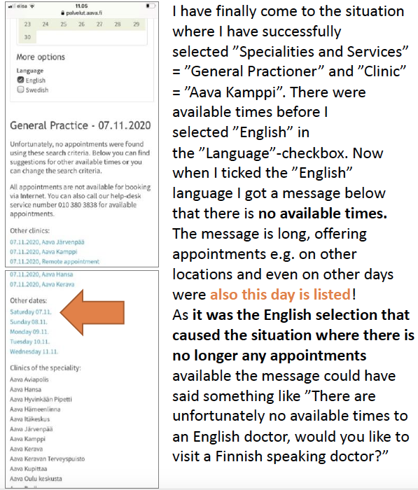
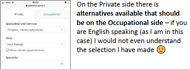
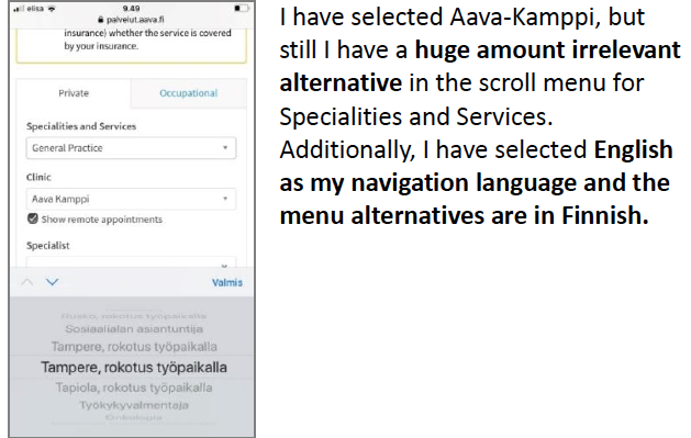
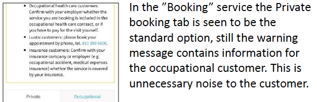
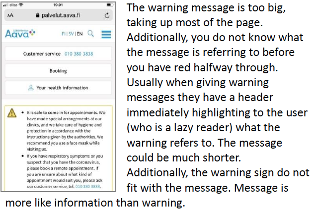
➡️ Original UI
This is the original user interface (mobile version) of the Aava booking service.
3.
Initial Prototype
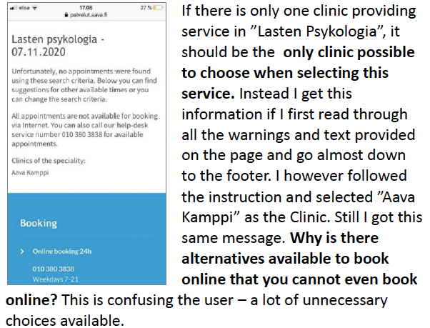
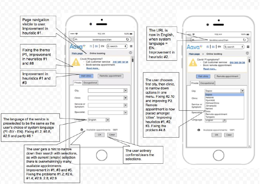
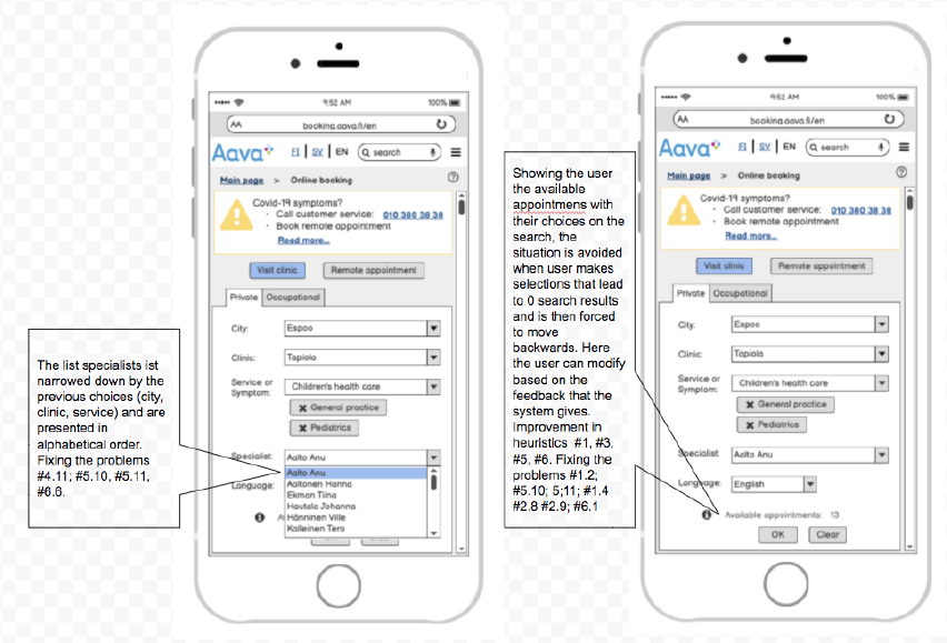
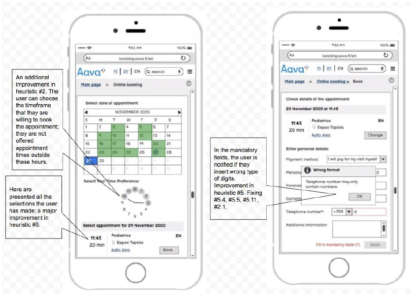
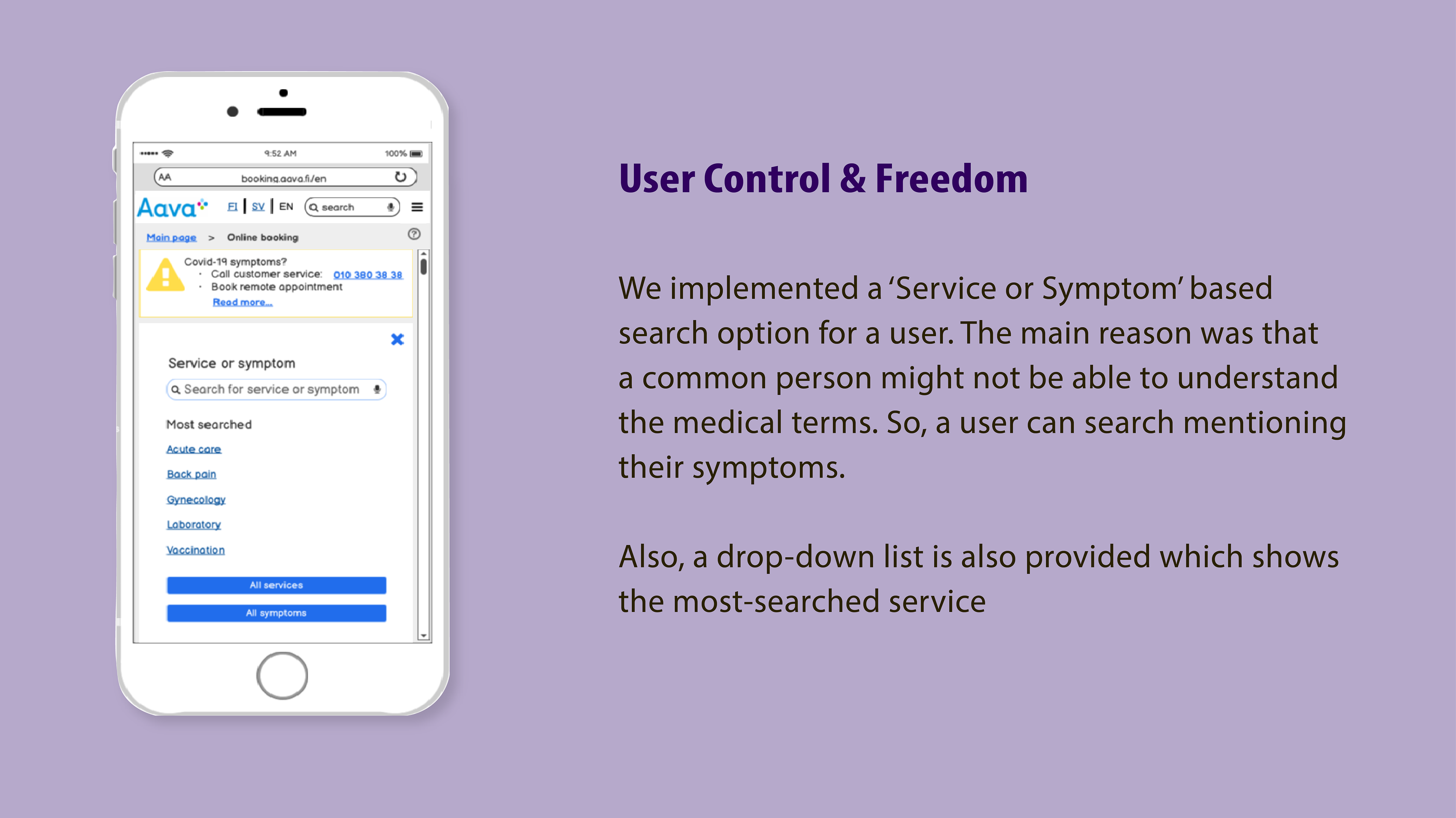
Most of the prioritized usability problems concern the search and selection functions. Therefore, this was the focus of the improvements in designing the prototype UI.
➡️ More Freedom to Users
The user has given more freedom to go back or clear their selections, without having to scroll up and down the page; by pressing the cancel button, the system shows again all the available values of the menus. The user has the freedom to start the selection from any menu (value), and the other selections will be updated dynamically.
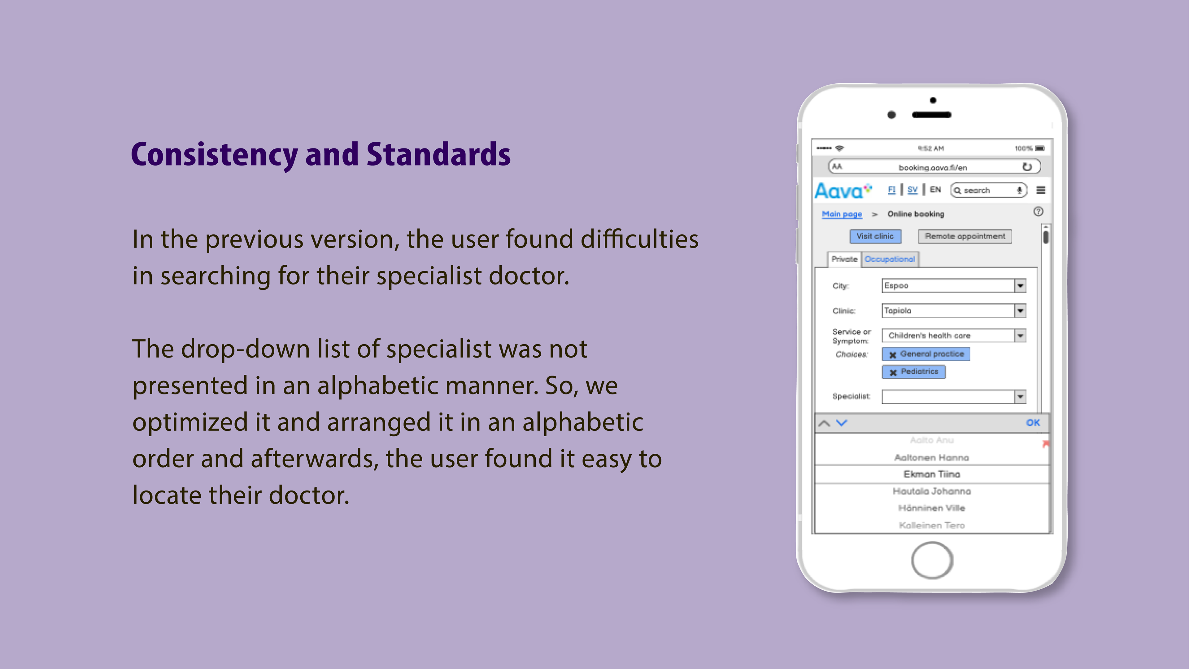
➡️ Dynamic Drop-Down List
The content of the lists will be affected by the choices the users make in the other boxes. In practice, this means that if a clinic is selected only the specialists working at that clinic will be listed in the drop-down menu.

4.
User Testing
The aim was to evaluate our own designed prototype which is the improved version of the original Aava's website in mobile. The user testing phase involved actual test users.
➡️ Goal
The goal was to test the prototype for usability and identify as many usability problems as possible.
➡️ Final Review
Before actually testing the prototype with the user, we had a final review of it and made some minor corrections in the functionality.
➡️ Method of User Testing
Location: Finland, Remote, Via Zoom
➡️ Facilitator & Participant
We selected a partially remote method for user testing where the facilitator and the participant are at the same place.
➡️ Usability Testing Scenario

➡️ 5 Second Test
Before the actual scenario-based testing, we had this '5-second test' with the participant, where the starting screen was shown and was asked 'What did you see'?
Response: "Some kind of booking service"
➡️ Questions during evaluation
These questions were only be asked if the user is facing any problem:
1. What do you want to do?
2. What were you expecting to happen?
3. What is the system telling you?
4. Why has the system done that?
5. What are you doing now?
➡️ Questions after evaluation
These are the questions asked after the evaluation:
1. What was the easiest part of the prototype?
2. What was the most difficult part of the prototype?
3. What was the most annoying in the prototype?
4. What did you like the most?
5. What needs changing?
6. Do you miss something in it?
7. Would you be likely to book an appointment online?
8. Did giving commentary distracted you?
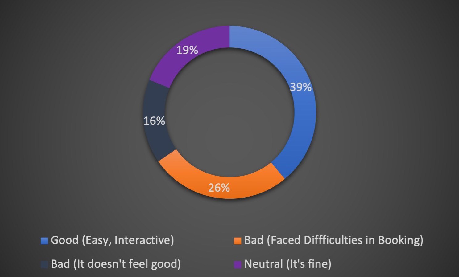
➡️ Few answers from the participants
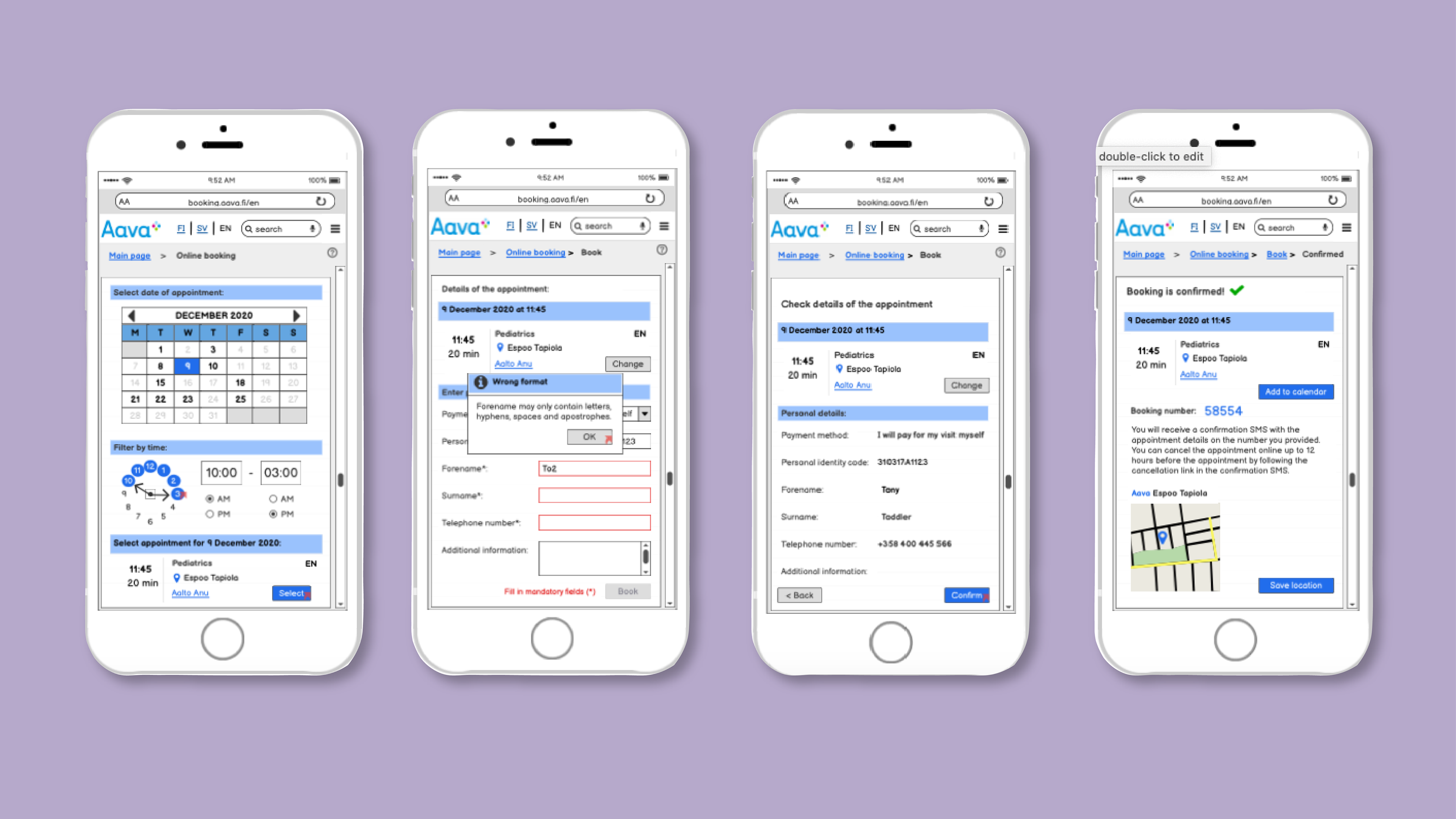
1. The participant liked that the information about the doctor and time was displayed in the different views, but still, as the participant always wants to double-check everything one last confirmation page would have been nice.
2. The beginning was choosing the clinic and where to go as everything was in the correct order to choose and it was simple. It went quite fast to perform this step.
3. The personal information page. Maybe because it was a prototype but finds this step most difficult in general as it can be difficult to understand some questions like the payment method. In general, did not find anything that was super difficult, everything was pretty clear.
4. Something that might be annoying when using it on the phone is if there is a lot of scrolling in lists with a lot of options. It can be difficult to scroll on the phone and make sure your finger ”hits” the correct option. Fingers can slip.
5. The participant notices it is only a prototype, but the buttons ”Save appointment to calendar” and ”Add location to navigator” we could make simpler. They are quite small and could be less specific to make it easier for the user. Likes simplicity as it makes it easier for the user.
5.
Final Prototype
➡️ What I have learned from this project?
The biggest fear from this project was "How can we even make it better as it is already well designed"
But with time, a lot of evaluations, and research we were able to find problems and fixed them. I learned that being patient is key to success. I had the pleasure to be the project manager in the user testing phase of this project and developed my skills in managing a skillful team. Being the facilitator in the user testing helped me build my confidence in talking to a user and getting the neutral and right feedback from the session.
🙏🏻
Thank you for your time in reviewing my work. Your valuable feedback will be much appreciated.