➡️ The Product:
A platform to help homeless people find shelter and food. At the same time, the sponsors can use this platform and provide funding. The platform is available for different screens including a responsive website and a mobile app.
➡️ The Problem:
Even in the 21st century, with all the advancements in every industry, there are people who sleep on the roads. Many people didn’t have enough money to fulfill their basic food necessities. Work needs to be done in order to help homeless people get rid of this situation.
➡️ The Goal:
To come up with a platform that will decrease the percentage of homeless people. This platform will allow sponsors to donate money as well.
➡️ My Role:
UX Designer leading the app and responsive website from conception to delivery.
➡️ My Responsibilities:
⚪ Conducting Interviews
⚪ Paper and Digital Wireframes
⚪ Information Architecture
⚪ Low and High-Fidelity Prototypes,
⚪ Usability Testing
⚪ Accounting for accessibility
⚪ Iterating on designs
⚪ Responsive Web Design
➡️ Project Duration:
July 2021 - August 2021
➡️ User Research
I dig into user research and conducted surveys and interview to know the needs of the users. Most of the people are now aged or middle-aged as they have been in shelters but were left out. The interview sessions helped a lot in getting valuable insights of what are the actual pain points of the users. From that, I was able to develop user personas and define problem statements.
Persona 1: Abel Chiumbo
Problem Statement: Abel Chiumbo is an immigrant in Finland. He is been here for 5 years. He is facing problems in finding a shelter with long queues in the publicly available homes. Having 3 kids, it’s getting difficult for him to manage everything

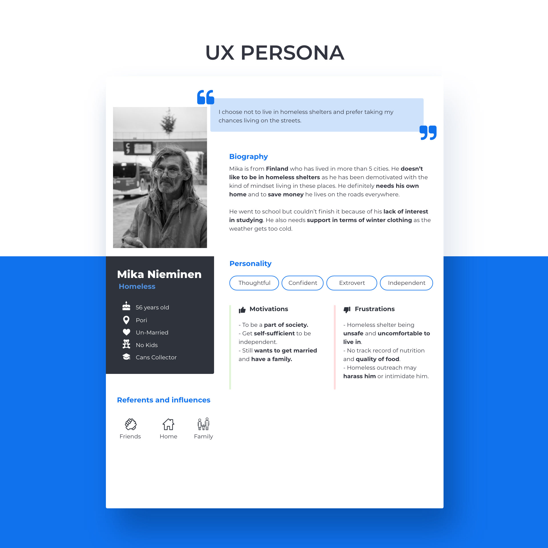
Persona 2: Mika
Problem Statement: Mika is a homeless guy who is living in Pori. He needs a shelter that feels like home. He also needs to have daily food for himself with no compromise on quality.
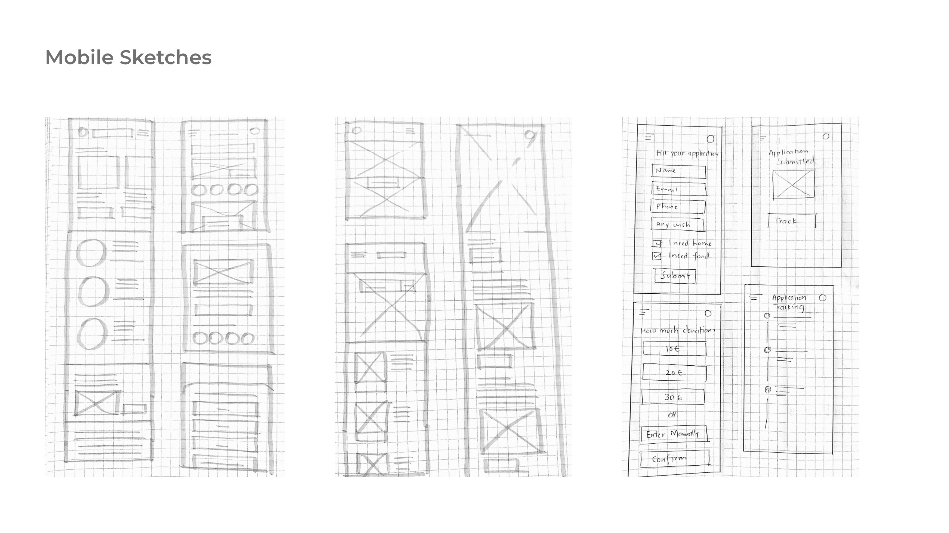
➡️ Ideation
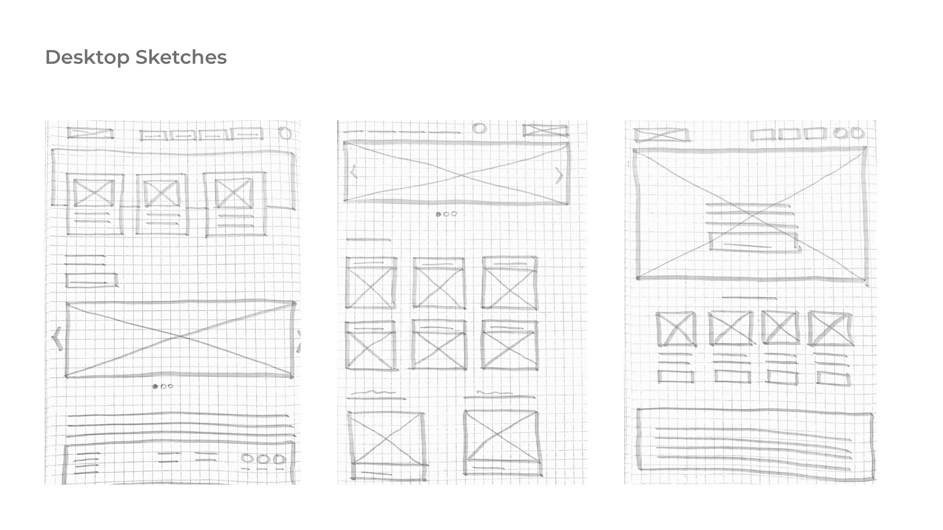
I used the design ideation process (human-centered approach) to generate a broad set of ideas without judging or evaluating them. I tried to come up with as many ideas as possible even if they seem to be ridiculous because sometimes an outrageous idea might turn into a great and unique solution. Below are some of the rough sketches I made using pen and paper for desktop and mobile versions:
➡️ Design
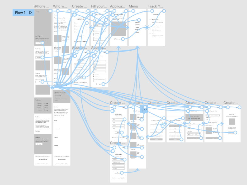
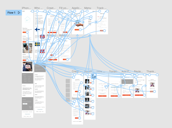
Low-Fidelity Prototype
To prepare for usability testing, I created a low-fidelity prototype that connected the user flow of the whole process.
➡️ Testing
Parameters:
⚪ Unmoderated Usability Study
⚪ Remote Sessions
⚪ 6 Participants
⚪ Length of session: 30-40 minutes / session
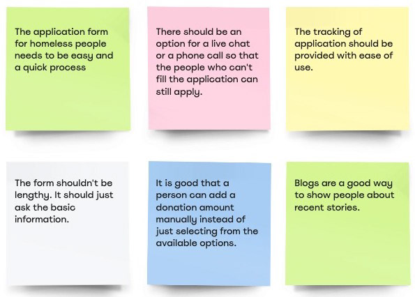
Insights from usability study:
➡️ Mockups
Based on the insights from the usability studies, I applied design changes like providing a chat option instead of filling everything, users can just write it to the chat and the support team will take care of all the application processes.
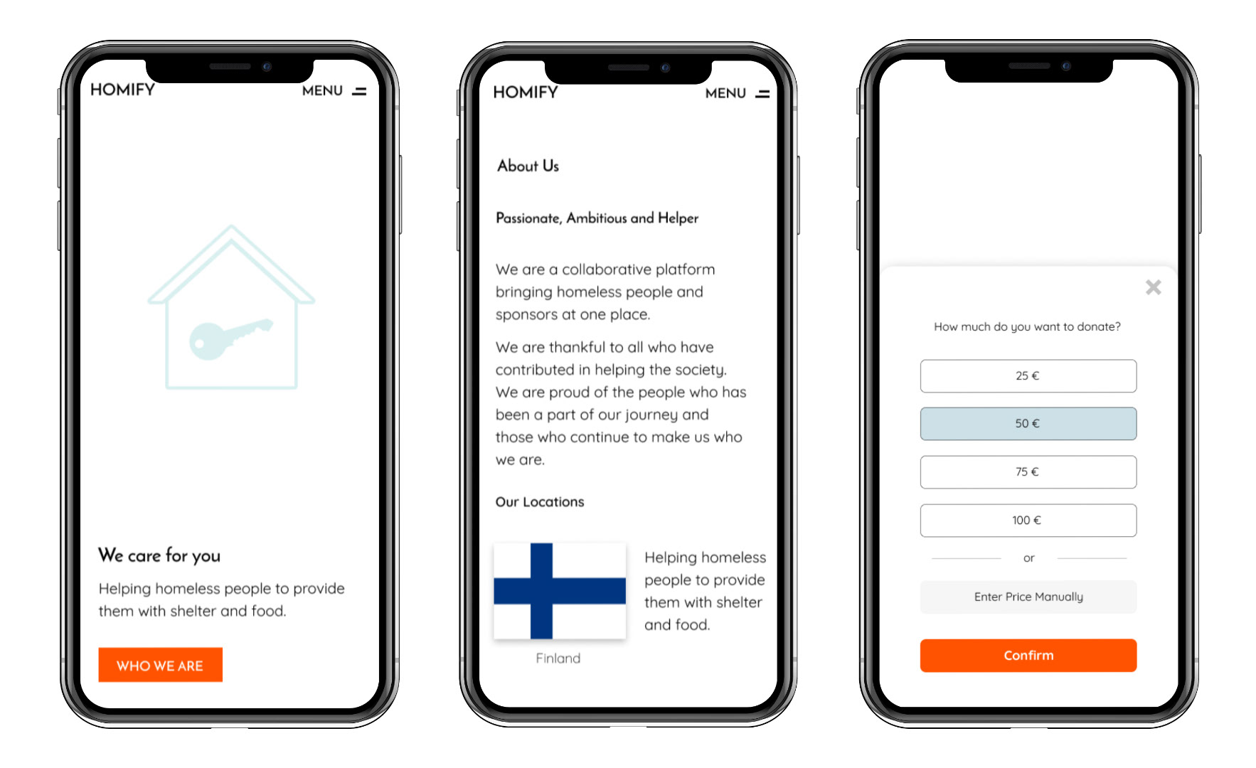
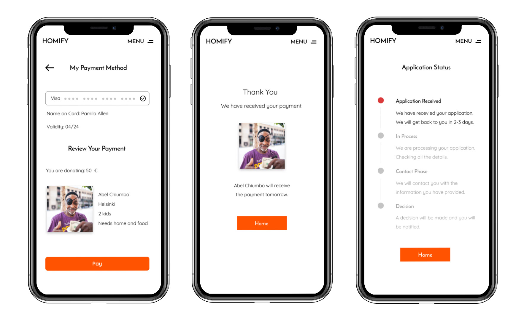
➡️ High-Fidelity Prototype (Mobile Version)
The high-fidelity prototype followed the same user flow as the low-fidelity prototype, including design changes made after the usability study.
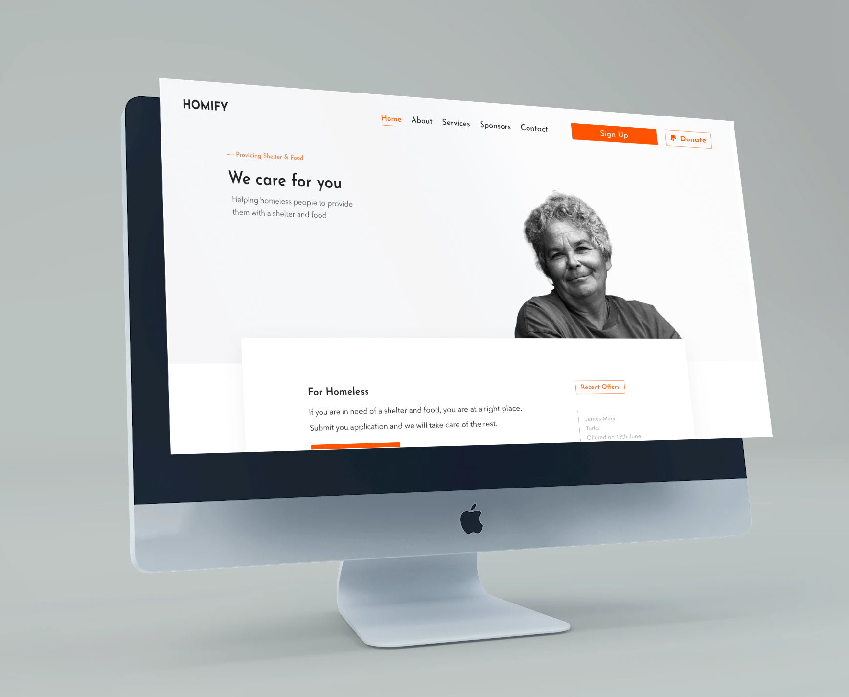
➡️ High-Fidelity Prototype (Desktop Version)
Link to Adobe XD
➡️ Accessibility Considerations
⚪ Clear labels for interactive elements that can be read by screen readers.
⚪ A simple and minimalist design so that the users don't get confused.
⚪ A bright color theme so that old people don't face any problems and don't get frustrated with several colors.
⚪ Providing a chat and phone call option if the users can't fill the form and add their details.
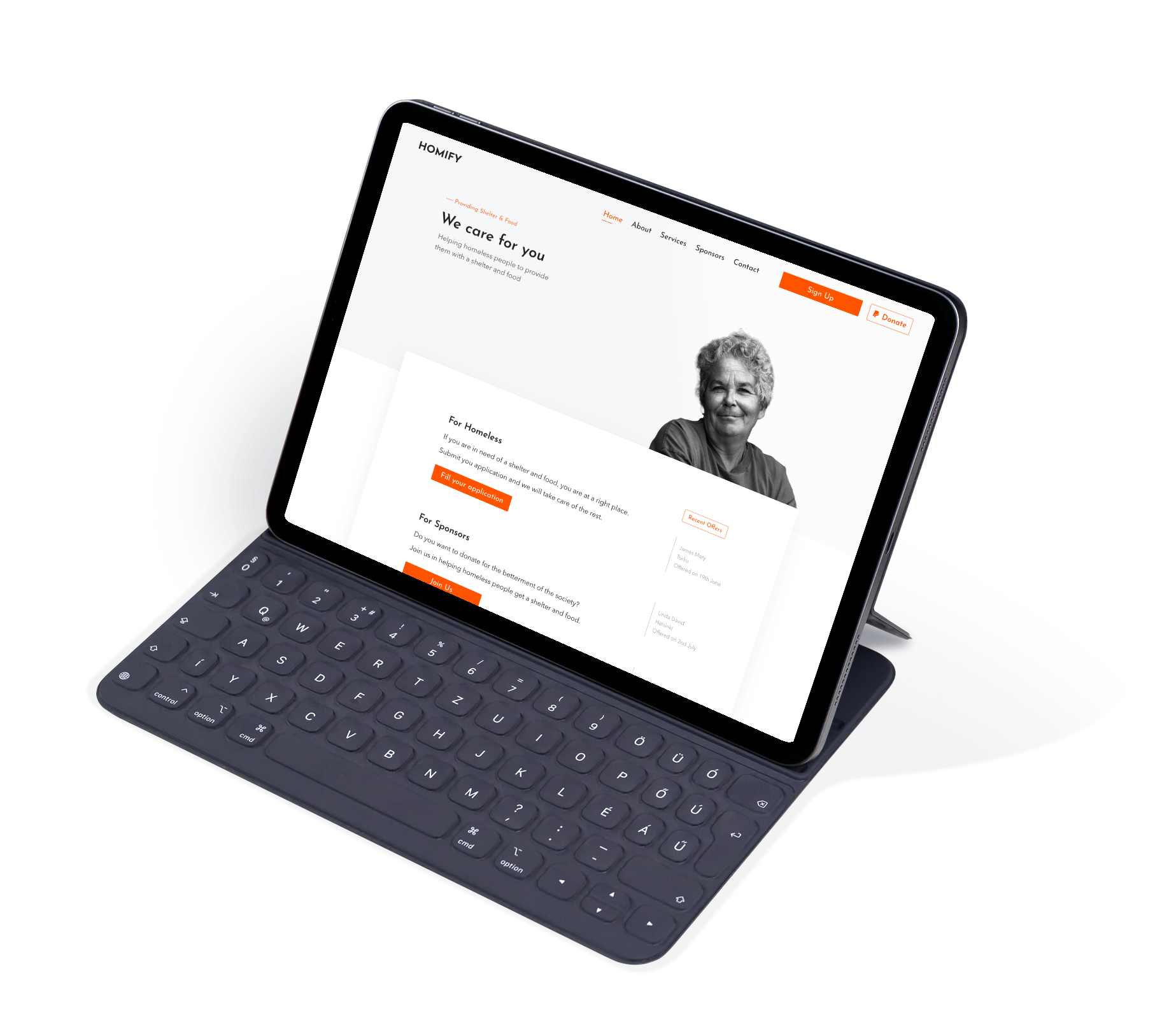
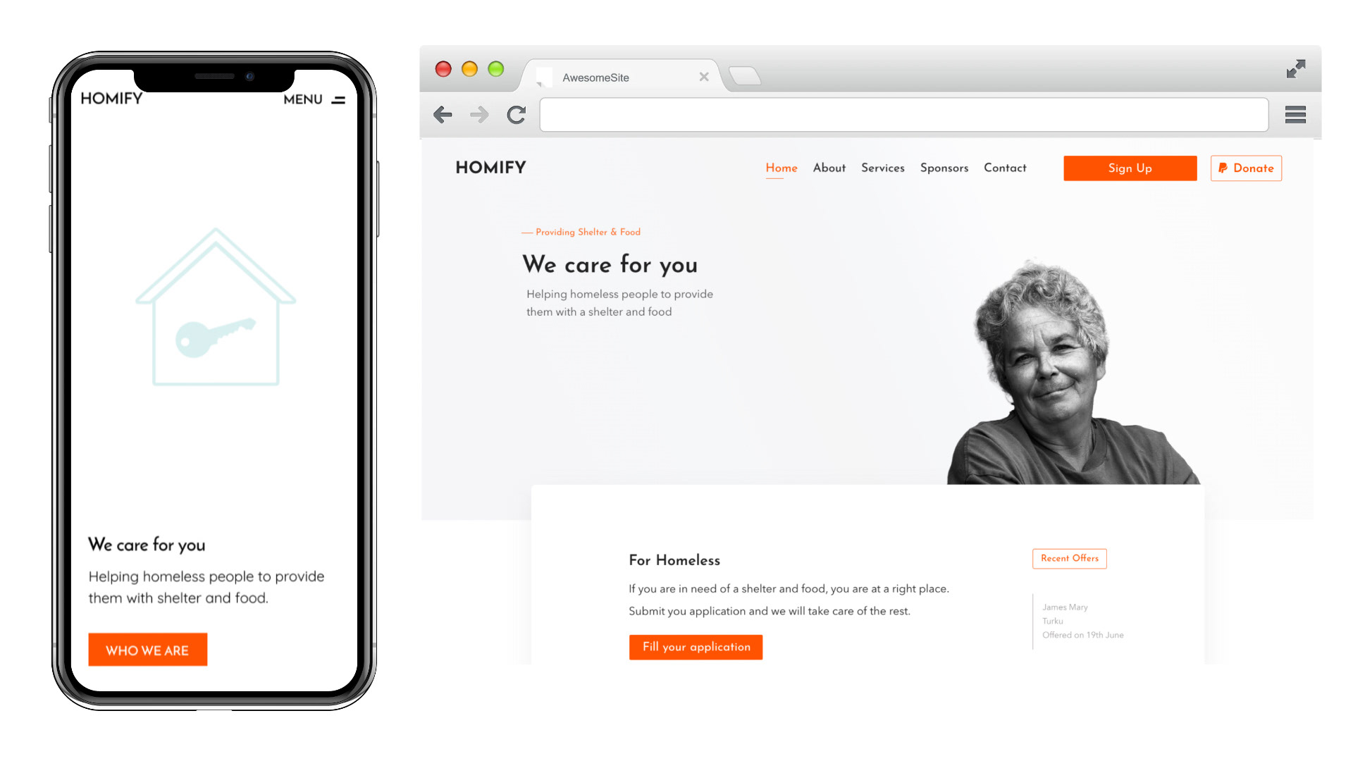
➡️ Responsive Web Design
The designs for screen size variation included mobile and desktop. I optimized the designs to fit the specific user needs of each device and screen size.
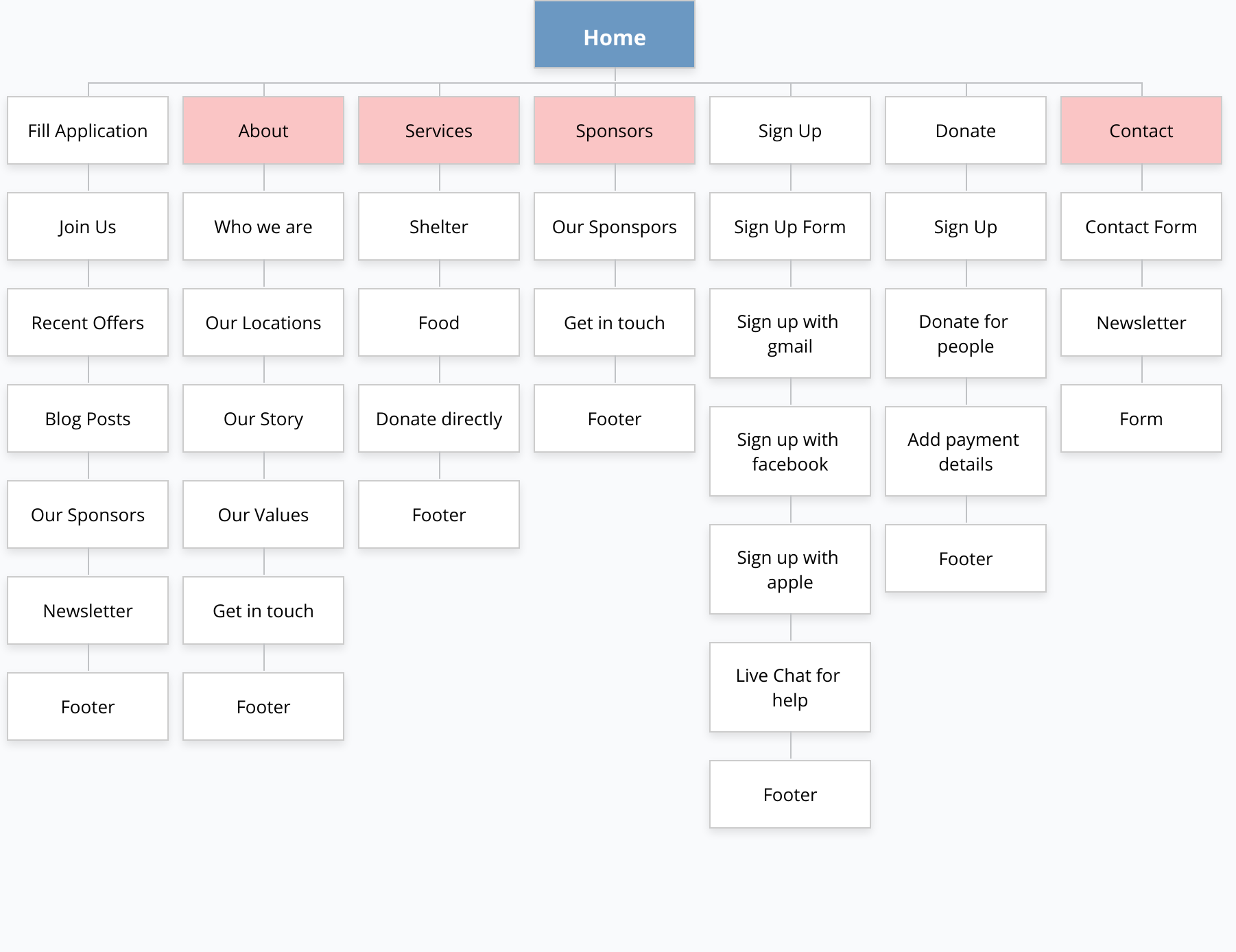
Information Architecture:
With the app designs completed, I started work on designing the responsive website. I used Gloomaps and created the design to ensure a cohesive and consistent experience across devices.
Impact:
First of all, this idea was really appreciated by the users as these people are mostly forgotten. The process and the application filling were made easy which users found as well. All the users were able to submit the application and one user tried to use the chat option to get help from the support people.
What I have learned?
I learned that even though the problem I was trying to solve was a big one, diligently going through each step of the design process and aligning with specific user needs to be helped me come up with solutions that were both feasible and useful.
Next Steps:
⚪ Conduct research on how successful the app is in reaching the goal to reduce homeless people.
⚪ Add more and easy ways for the un-educated people to provide easiness with the application process.
⚪ Provide recognition to the sponsors who are helping in getting people their homes and food.
🙏🏻
Thank you for your time in reviewing my work. Your valuable feedback will be much appreciated.