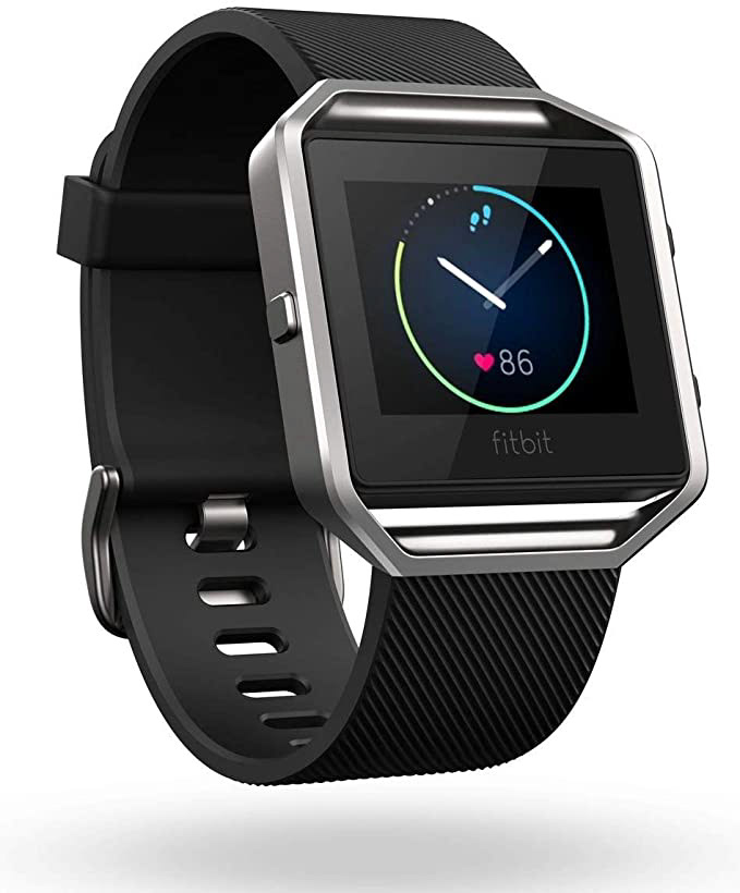
Product:
Fitbit Blaze Smart Watch
Goal:
The goal of this project is to analyze the usability or user experience-related issues with the Fitbit smartwatch.
My Process:

Nielsen Norman's Heuristic Evaluation
The problems which I have found while analyzing the product are associated with the following heuristics:
⚪ Visibility of System Status
⚪ Flexibility & Efficiency of Use
⚪ Help & Documentation
⚪ User Control & Freedom
⚪ Error Prevention
➡️ Problem 1:
There is no signal of connectivity of a watch with a mobile device even though it is connected with a mobile device via Bluetooth. This goes against heuristic #1 where the status of the system should be visible to the user. The user has to figure out if the watch is updated or not by checking their phone.
"No connectivity update on the watch"
➡️ Problem 2:
This issue is also connected to 'Problem 1', lack of system visibility. Whenever the smartwatch gets connected with a mobile device, the users should get some notification of a quick message on the watch for confirmation.
➡️ Problem 3:
The use of buttons is confusing. A user has to try it out initially to get a surprise about the button's functionality.
➡️ Problem 4:
There is no 'Always-on' feature for the display as there are times when users need to see the update instantly and want the display to stay awake all the time.
➡️ Problem 5:
Finding a way out or going back is confusing. Users have to try out the buttons to see how to go back.
➡️ Problem 6:
Shutting down the watch is very common, this option is hidden in the settings option. The user has to locate the settings option first and then find a shutdown feature.
➡️ Problem 7:
Brightness Control is the most commonly used feature in different times of the day and night. It is also hidden in the settings option and no shortcut is provided to the user.
➡️ Problem 8:
This issue is also connected to 'Problem 1', lack of system visibility. Whenever the smartwatch gets connected with a mobile device, the users should get some notification of a quick message on the watch for confirmation.
➡️ My Proposal for corrections:
1. I’ll add a connectivity indication on the main screen of the watch that will directly allow the user to connect it with the device. Or if the device is connected, I’ll add a small connection symbol or icon that will tell a user that it is connected to a mobile device. According to heuristic #1, a user should be informed about the status of the system.
2. The buttons need to be designed in a way that tells the user about their function. I would at least add short helping material to let users know the functionality of buttons.
3. Always-on feature is control given to the user if they want the display to stay on, I’ll add this new feature providing a user the flexibility of use.
4. A helping material telling the user about the controls will help to prevent the errors.
5. I’ll add a shortcut key or control on the main display where users can control the brightness and can shut down the watch instantly if they want to.
➡️ Impact of the above suggestions:
By adding the above features, the users will have more control and freedom to use Fitbit blaze, have system visibility and save their time. This will improve the user experience as usability is an important aspect of the overall user experience.

Usability Testing - Users
I conducted quick testing with the users who are using different smartwatches to get the insights. I asked users to:
⚪ Check on the watch if it is connected to the mobile device?
⚪ Shut down or turn off the watch.
⚪ Change the brightness of the display
⚪ Let the display be on all the time.
⚪ Go back to the previous screen if you are in settings options.
➡️ Results:
⚪ All the participants weren't able to see if the watch is connected to the device. Two participants check their Fitbit mobile application for confirmation.
⚪ Participants had to search for different folders to see the shutdown option. One participant tried to press the left button (she thought it is for shut down).
⚪ 90% of the participants were confused about where to look for the brightness control.
⚪ 60% of the participants went straight to the settings option to see if the display-on feature is available or not.
⚪ 55% of the participants tried the right two buttons to go back and the rest of the participants tried to swipe right to see if they can go back.

Refine the Design
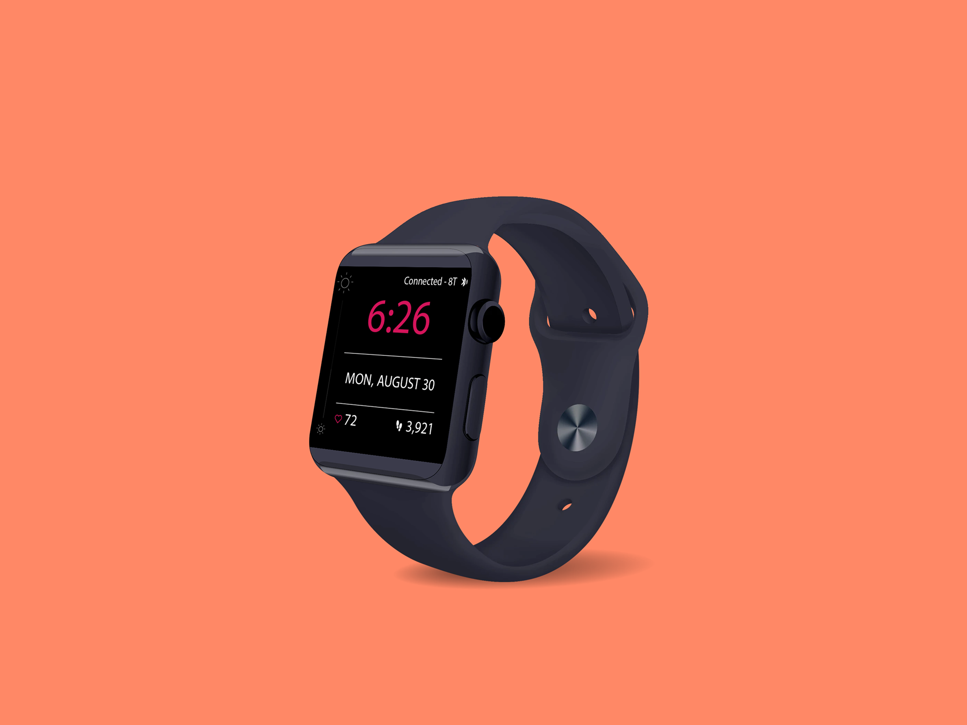
I did some quick sketches and refined the design based on my heuristic evaluation and feedback from users based on usability testing.
Improved Version has :
⚪ a connectivity status
⚪ a slider to change the brightness

"Previous and New Verison - Sketch"
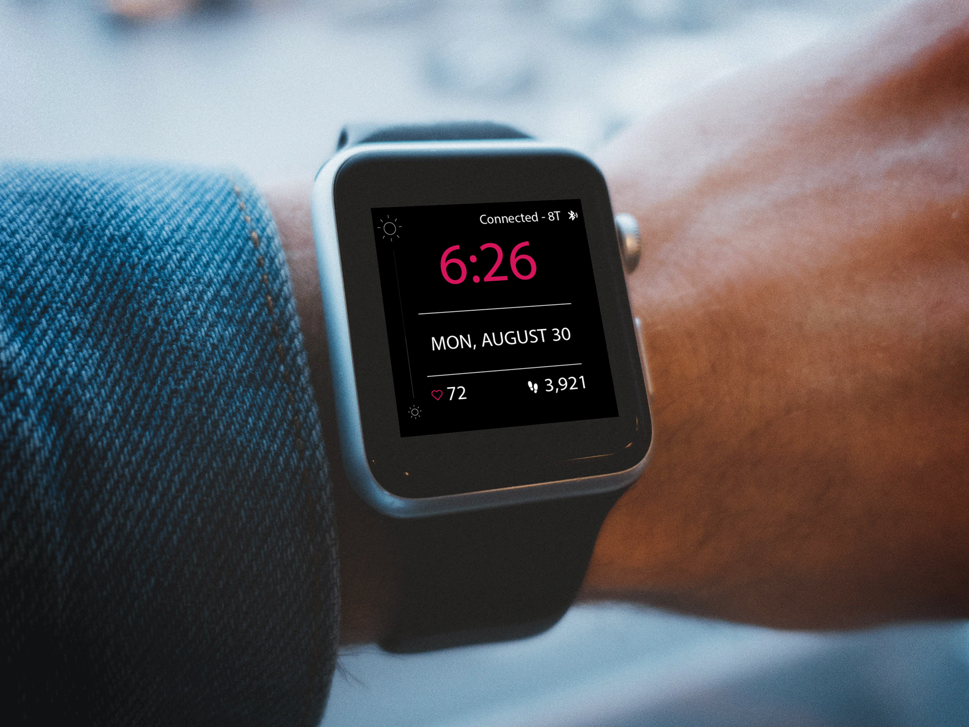
"Used a mock-up watch to display my design"