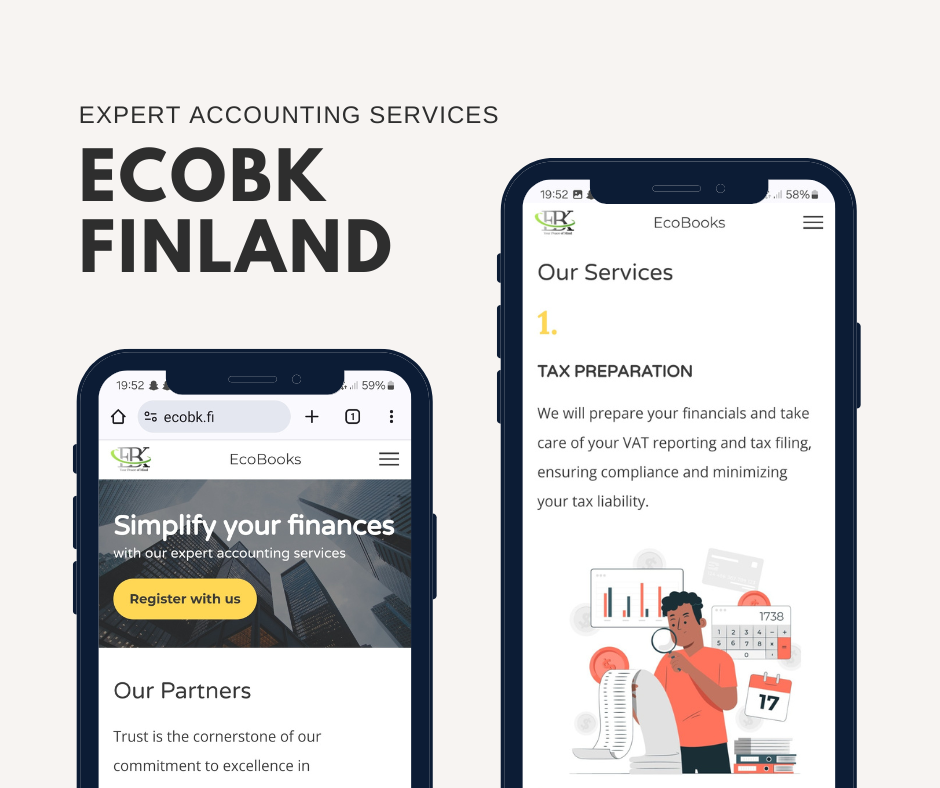
➡️ Project Description
A website renewal project for an accounting service provider.
➡️ Challenges
Ecobk is an accounting service provider based in Espoo, Finland. With an outdated website that lacked modern design, responsiveness, and intuitive user experience, Ecobk has been looking to renew its website. With no prior research and efforts around the user interface, Ecobk wanted to renew their website
➡️ My Findings
I started with a thorough analysis of the existing website performance and user's feedback to identify the pain points and the areas of improvement.
I found out the following areas that needed improvement:
🌟 Complex Navigation
🌟 Cluttered Layout
🌟 Lack of responsiveness
🌟 Inconsistent Branding
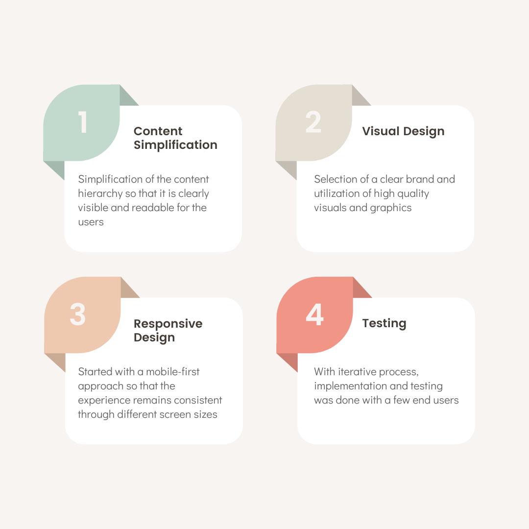
➡️ Design Process
As it is a single page website, the navigational aspect was not of a big concern. But the content hierarchy has to be taken into account. I followed the following design process in this project work based on the time constraint and other resources:
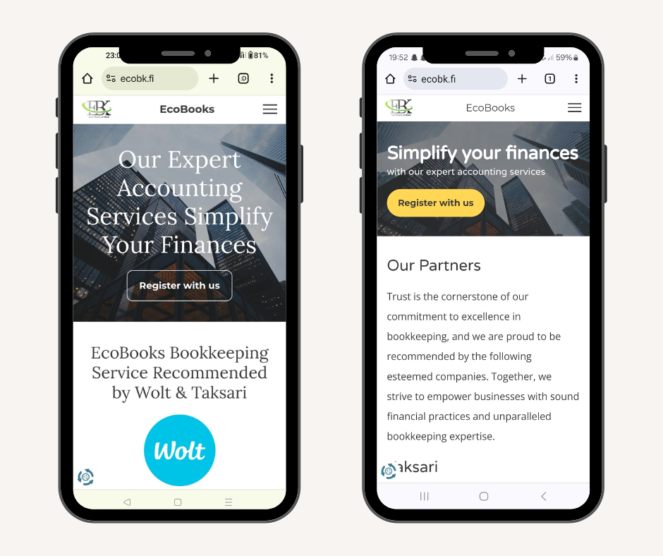
➡️ Comparisons
1. First impression
In the renewed website, I focused on enhancing the first impression by streamlining the user interface and optimizing the user experience for straightforwardness and readability. Here are the key improvements made:
🌟 Simplified Layout
🌟 Visual Hierarchy
🌟 Optimized Typography
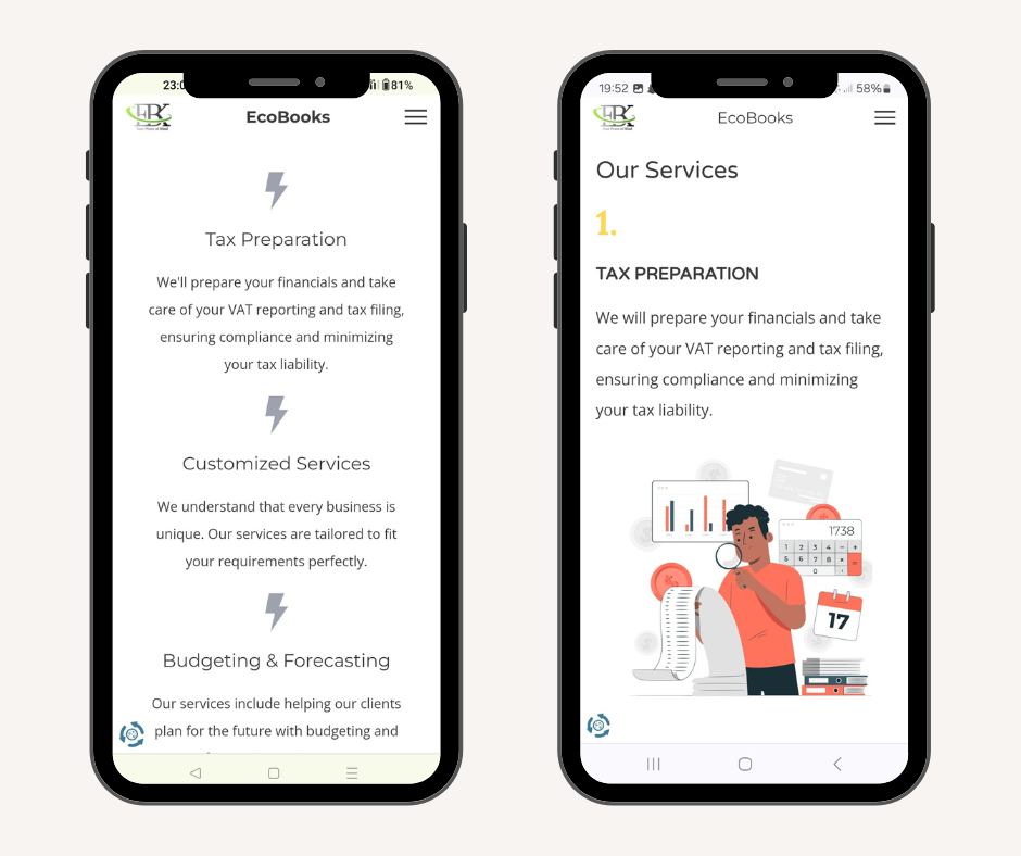
2. Our Services:
Here are the key improvements and areas that were targeted for the services section:
🌟 Visual Representation
🌟 Image and text usage
🌟 Simplified Layout
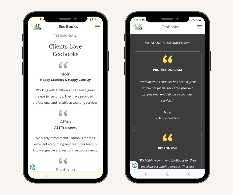
3. Clients Feedback:
Here are the key improvements and areas that were targeted for the customer's reviews:
🌟 Improved Visual Design
🌟 Branding (Color Usage)
4. Pricing for Toiminimi:
I focused on optimizing the pricing section to provide transparency, clarity, and value to the clients. Here's how I improved the pricing experience:
🌟 Visual Representation
🌟 More Readable and Clarity
🌟 Icon Usage

5. Pricing for Osakeyhtio:
I focused on optimizing the pricing section to provide transparency, clarity, and value to the clients. Here's how I improved the pricing experience:
🌟 Visual Representation
🌟 More Readable and Clarity
🌟 Icon Usage

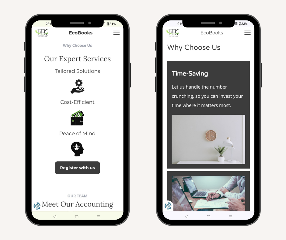
6. Why choose us:
I reimagined the 'Why Choose Us' section to showcase the unique value propositions and benefits that set us apart from competitors. Here's how we enhanced this section:
🌟 Visual Representation
🌟 Image and Text Approach
🌟 Clear Message
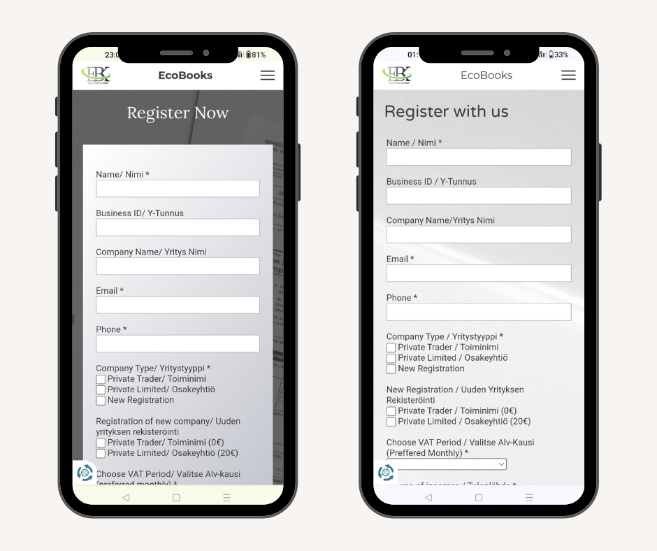
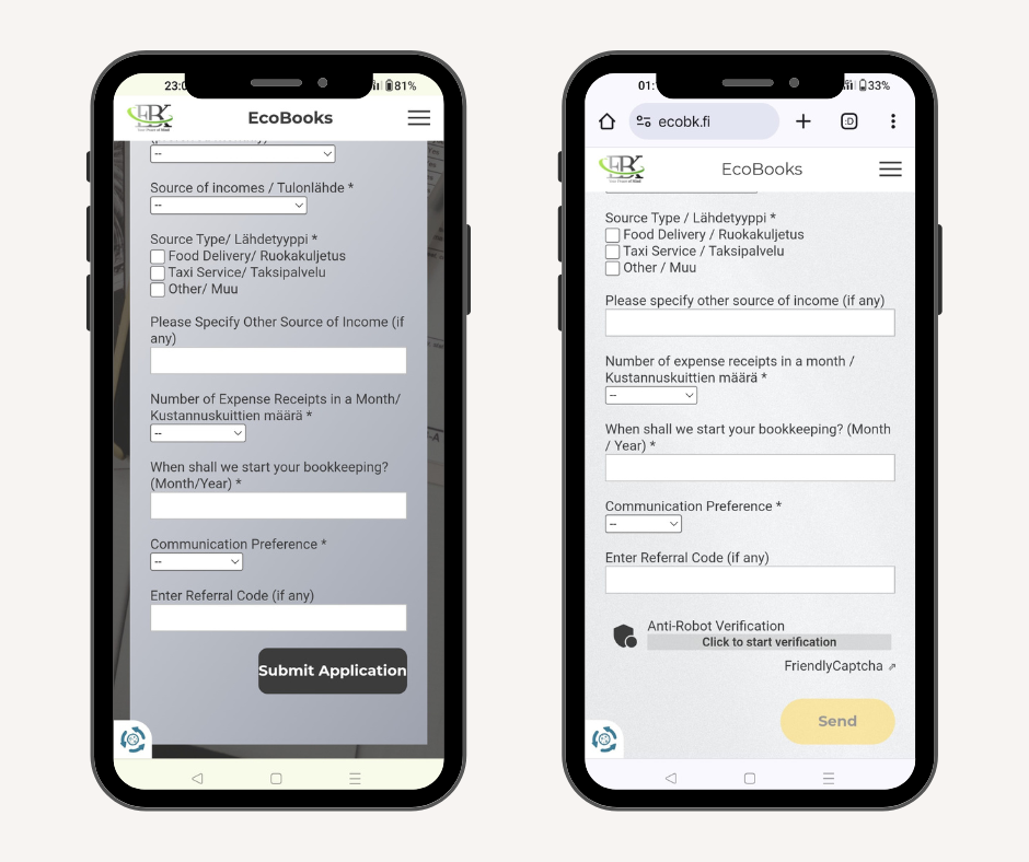
7. Register with us:
The form had all the required fields so mainly, I looked into these areas to improve the design:
🌟 Background Changes
🌟 Clear and to-the-point headings
🌟 Visual Layout
🌟 Button Padding
➡️ Client Feedback
"The redesigned website now provides a more intuitive and engaging experience for our visitors, with clear navigation, streamlined content presentation, and enhanced visual appeal. The first impression of any product, service or website is very important and we are happy that more customers have started to reach out for our services after our website renewal."
Ecobk Finland